Advanced Typography: Task 03

WEEK 10 - WEEK 14 (30/05/2022 - 27/06/2022)
Adena Tan Sue Lynn (0345769)
/ Bachelor of Design (Honours) in Creative Media
Advanced Typography
Task
03: Design Exploration & Application
DIRECTORY
- Lectures
- Instructions
- Final Submission
- Feedback
- Reflection
- Further Reading
- References & Image Credits
LECTURES
Lectures 01 - 02 are located in Task 01: Exercises.
Lectures 03 - 04 are located in Task 02: Key Artwork & Collateral.
Lecture 05: Perception & Organisation
Perception: The way in which something is regarded, understood or interpreted.
In Typography, it handles visual navigation & interpretation of the reader with contrast, form & organisation of content. The content can be textual, visual, graphical or colour.
Contrast

For contrast, Carl Dair adds two more principles; texture & direction. It is said to make design work and meaning pop out clearly & unambiguously, with flair.
Dair showcases 7 kinds of contrast; Size, weight, contrast of form, contrast of structure, contrast of texture, contrast of colour and contrast of direction.
Size

Provides a point which draws the viewer's attention. Most commonly used when making a title or heading noticeably thicker than the body of text.
Weight

Bold type can stand out in the middle of lighter type of the same style. Besides the usage of bold, using rules, spots & squares also provide a "heavy area" for powerful points of visual attraction or emphasis.
Form

Distinction between a capital letter & its lowercase equivalent or even with a roman letter & it's italic variant.
Structure

Refers to the different letterforms of different kinds of typeface.
Texture

Putting together contrasts of size, weight, form & structure, while applying them to a block of text, it creates a contrast of texture. This depends partly on the letterforms themselves & partly on how they're arranged.
Direction

Refers to the opposition between vertical & horizontal & every angle in between. Mixing wide blocks of long lines w/ tall columns of short lines can also create contrast.
Colour

Usage of colours suggest that a second colour is often less emphatic in values than plain black & white. Thus, it is vital to think about the elements that need to be emphasised, and pay attention to tonal values.
FormRefers to the overall look & feel of elements that make up the typographic composition. It plays a vital role in visual impact & first impressions. Good form usually is visually intriguing, which leads the eye from point to point while entertaining the mind.


The interplay of meaning & form bring a balanced harmony to function & expression. When typeface is perceived as a form, it is no longer read as a letter. This is due to manipulation by distortion, texture, enlargement of extruded into a space.

Gestalt
Gestalt Psychology is an attempt to understand the laws behind the ability to acquire and maintain meaningful perceptions. Laws developed by Gestalt psychologists (especially Max Wetheimer) predit how perceptual grouping occurs under a variety of circumstances.
Gestalt theory emphasizes that the whole of anything is greater than its parts. Instead of breaking down thoughts & behaviour, the gestalt psychologists believed that one is supposed to look @ the experience as a whole.

INSTRUCTIONS
Creating Typeface
Firstly, we were tasked to create a proposal of ideas for our Task 03. Below are the slides which I presented during Week 9's class.
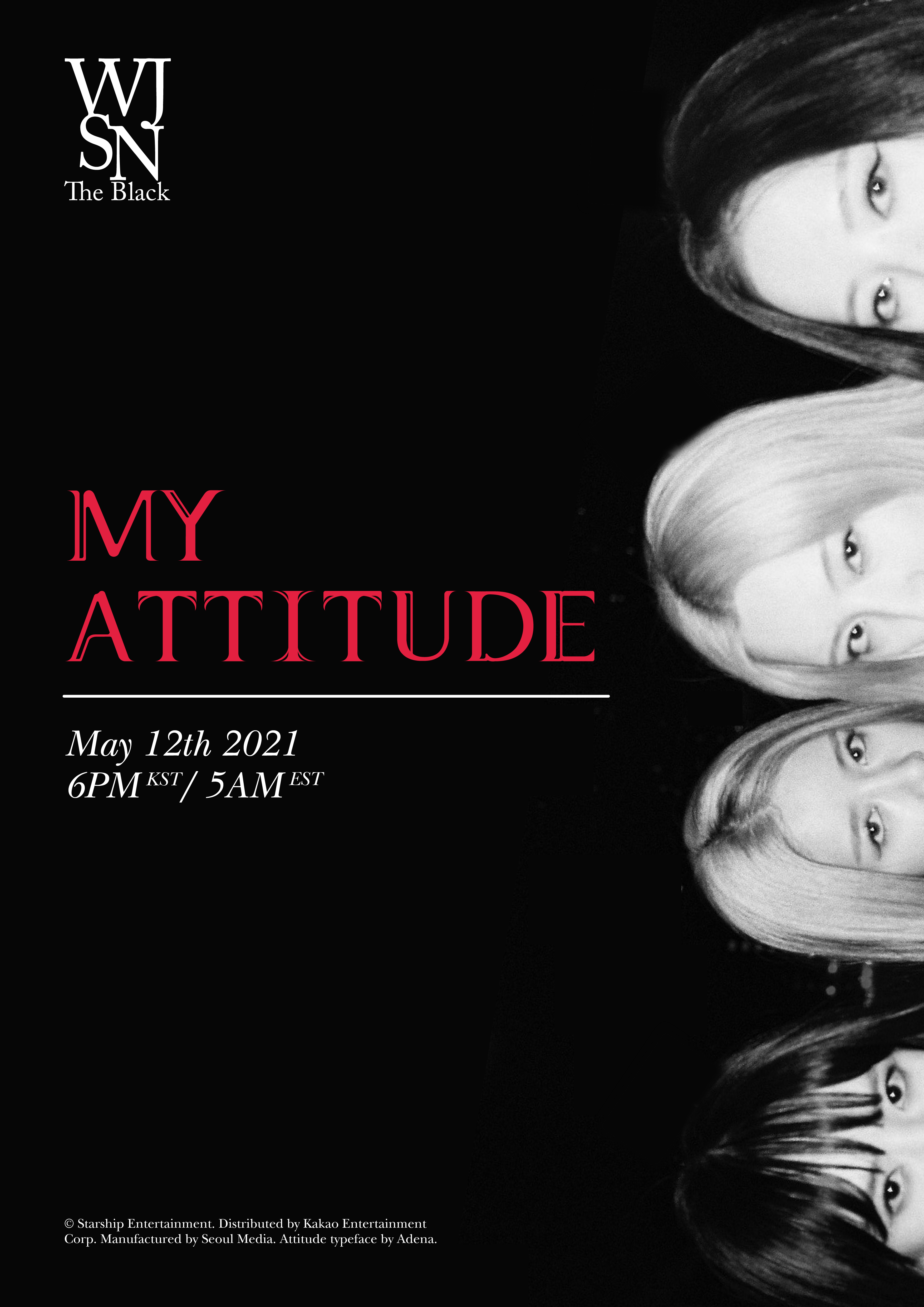
After receiving feedback from Mr Vinod, I ultimately decided for Idea #3 which was to create a typeface for WJSN The Black's The Attitude album. For me, I thought this idea would bring me the most fun and passion among the three ideas, so I went along with it.
I initially came up with this idea when I was brainstorming and the song started playing. Then, I remembered how I remembered how just a few weeks ago, I thought the cover didn't match the sultry and sexy feel and look of the sound, music video and the choreography.
To me, the album cover was basically a disservice towards "Easy" and the other song on the album, "Kiss Your Lips". Both are incredibly sexy songs which I thought deserve an interesting look to them.
First, I decided to look at some album covers which had typography to study how a group's song/concept matched the typography used for the albums. Below are just some screenshots I took:


After this, I started sketching. For the first initial letters, I went with the letters, A, O, T and H as previously done in my Typography Task 03(A): Type Design & Communication.


For a majority, I think you could say I was very inspired by the type in WJSN's Natural album cover, which then inspired about four of them. However, I didn't want to create one which was overly similar, thus I created the third one on the right. To me the serifs made the letterforms sexier, which allowed for it to fit the concept better. Another element which I included were thin lines adding a 'round', 'smooth' look to the letterforms. I thought it suit it well as the lines represented 'slipping in' which fits the "Easy" music video where a heist is being conducted. Overall, I thought this idea was the best, therefore, I decided to continue with that idea and sketch the alphabet for it.

Next, I headed onto Illustrator as I wanted to get started right away.
First, I built the shapes of some letters using rectangles and circles. Example is below of how I tried to construct the letters A, H, F, L, T & I.


At first, I thought the forms of the letters were just okay. To me, some letters were a bit more blocky and stiff than I wanted (P & A ). Luckily, with Mr Vinod's feedback, I was able to create letters which were more legible while maintaining the look I was going for in the first place.
First, I started creating some letters with the same form, but tried to think of better ways to build the form. Below are some examples of them.

Soon enough, I was able to create all my letters, numbers and some punctuation. Below is the screenshot of the final letterforms.

For generating my typeface, I wanted to try out FontForge. This was because of this article. However, my laptop didn't want to open the application, which was really frustrating.
Moving on, I used FontLab7 to create the files for my typeface. Luckily for me, I got a new laptop since Semester 01, which allowed me to use the 30 day free trial again (Is this a hack?). I rewatched the videos which were supplied to us in Semester 01 Typography as I needed a refresher on how to use the application.

I got back to work immediately!

I also did Kerning. Below is the one I did for the alphabets.
Below is my final generated typeface.

Design Application
For the application, I knew I wanted to create items which were similar to the ones used in the KPop industry. Thus, I came up with a small list.
- Album Cover + CD
- A Spotify Simulation
- Poster
- Photobook
For album cover + CD, I looked at what I had lying around. Below are some photos of the albums I do have.


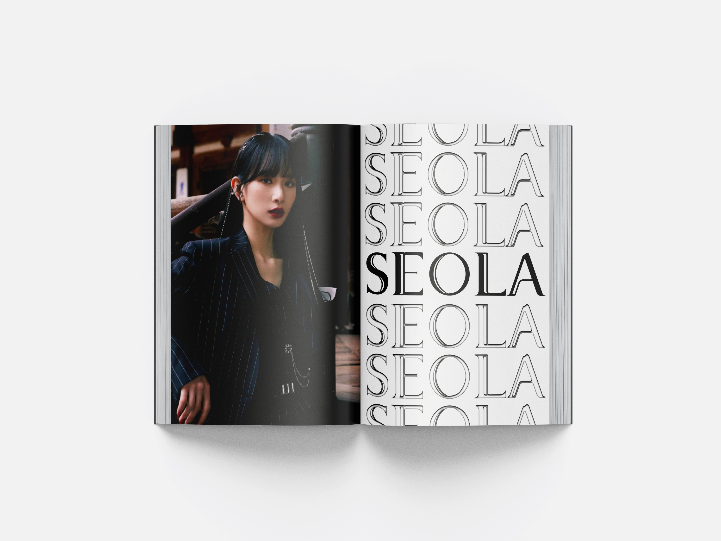
Thus, I intially thought of creating specific versions for each member. So, I created my first one.

Imagery: I took some stills from the music video, which I thought looked cool. Specifically, the above shot of Seola is @ 2:38. I also applied a slight transparency to make the image darker.

Type: I proceeded to use something which I had learnt previously for the group name and the album title. This included a combination of fills, inner glow and transform. Usually, this effect is used on white backgrounds, but I thought of giving it a try on a black background.
Next for the CD, I had some trouble figuring out how much space it needed (even tho the solution was simple, I'm was quite dim in the head when I was doing this initially). Somehow, due to my brain not functioning fully, I had multiple attempts of getting the CD how I wanted it to look. This led to some mishaps, such as:

Overall, I had an embarrassing amount of fails, which can be seen right here:

After a few tries, I finally got the hang of it. Below is the CD.

Below is the CD & Album Cover compiled.

After receiving Mr Vinod's feedback on the same day, I tried making more covers again. First, I tried to play around with the axial typographic system with the tryouts below. First, I tried to see which colours I preferred for the album cover. However, I decided that I did prefer the red due to the fact it felt more eye catching than the blue.


Below is the alignment I tried out for this.


Next, I decided to try out another style.


Version #3 of the attempt differs from the other covers I tried doing as I tried to make a super simple logo for the sub unit. I used Adobe Caslon Pro first to put the WJSN together. Then, I merged them using pathfinder and added curves wherever necessary.

Satisfied, I went to Photoshop. For this version, I wanted a more dynamic look. With that, I exported a transparent with just the album title, in order to apply Bezel & Level.

Next for my CD, I still wanted a more muted look, to provide more attention to the album cover. Thus, with more knowledge now, I created the below.

Then, I created the mockup yet again.

Spotify Simulation
For this, I first screenshot my phone screen when listening to the album.

Then, like many KPop albums, a lot of them have the cover art on Spotify different from the actual album. Following that, I tried to make my own as well. Thus I created the below.

Then, I put it together in a mockup template to create the below.

After getting Mr Vinod's feedback, I decided to follow what he suggested. Re-use the cover art and make the simulation straight. Thus,

Poster
First, I looked at current KPop comeback posters, like below:


First, I found an imagery I thought I could use for my poster.

For my first attempt, I was very inspired by Blackpink's poster.

Since I wanted to show some progress for class as well, I simulated the posters.


After getting some feedback from Mr Vinod, I proceeded to make another attempt with his advice.

I was quite happy with this version. However, I knew I wanted to try at least one more version. Thus, I created the two below.

For this poster, I decided for it to match better to the look of the album cover, with the usage of red. Truthfully, even though these attempts look 'simple', I feel like they suit the concept. Let me explain why!
Type: Overall, I feel like the different types have their own space to breath and allow for the viewers to take in everything better. I also really liked how the red looks in contrast with the greyscale surroundings.
Imagery: I feel like cutting off WJSN's faces was a good idea, personally. This is because their eyes feel very ~sexy & sultry~ which compliments the overall look I am going for.
Space: Personally, the space allows for breathing room, unlike my first version. I realised I didn't need to crowd too much...
With that, I simulated my chosen poster (Version #2, Attempt #1).

Photobook
First, I tried making a very simple layout.


Again, like the poster, I wanted to simulate it before class, which led to the below simulation:

For my second attempt, I wanted to try something else. Below are the pages:


Summary of Type: Problem Solving
To solve the problem that is WJSN The Black’s album, ‘My attitude’, which has a cover which provides a typeface which, I feel, does not fit the two songs featured well. The songs and the concept used by the group provide a sultry feel, which isn’t reflected in the typeface used on the album cover. My mission is would be to make letterforms based on the overall ‘sexy’ feel of the songs which fit WJSN The Black’s concept better.
Download Attitude-Regular here. [https://drive.google.com/drive/folders/1VRl8TwahO2R_4S8wqPyQN0LmHVeyS2x4?usp=sharing]

Application
Album Cover + CD


Spotify Stimulation


Poster


Photobook


Figure 3.6.1 Final Compilation, PDF, 27/06/2022.
FEEDBACK
Week 10 [30/05/2022]
Specific Feedback: There should be a purpose for the typeface design I intend to carry out. For my third idea, it was suggested to see if I could take the music video and make it a typographical video to fit my purpose.
Week 12 [13/06/2022]
Specific Feedback: Mr Vinod stated he was okay with my idea. However, he suggested if it might be possible for some spaces could be thicker, in order for them to be seen in small forms. He noted that so far, my letterforms seemed fairly constant, but he was slightly worried for the cross bar of the A.
Week 13 [20/06/2022]
Specific Feedback: When submitting the works, the simulation is fine. However, it is required to showcase the flat-forms of the artwork to showcase how the type works. For the jewel album, the cover art currently looks too dark. It is to note that if it is too dark, it will tremendously affect everything else. Next, Mr Vinod specified there should be a contrast between the album title and the band title, as currently there isn't any differentiation in the hierarchy of information. Next, he also advised me on better ways for showcasing the photobook, as it wasn't necessary to have the bleed. Perhaps, I could have done one page with a photo and another with usage of type. For this, Mr Vinod recommended to relook at the typographic systems. He also said to focus on the typography or the whole band as the basis of the visual. He told me to treat the cover with more thought and to maintain consistency in the marketing collateral. He also recommended for my background of my simulation to be consistent. He also advised not to stimulate in diagonals as the artworks are harder to see this way.
REFLECTION
Experience
Overall, this exercise was both a mix of pain and fun. I was initially very lost as I had zero idea what to do for this task. However, I'm grateful to have gotten this experience as I have better understanding how to design typefaces to suit a certain concept. I definitely think in terms of building type, I did a lot better than I did during Semester 01, which I'm really satisfied with as I've seen my progress. (I also felt more confident when building type this time around since I had gotten way more knowledge than I had then)
Observations
I believe this task has taught me how to observe more real life designs. I've never really thought about how the albums on my shelves were designed, only just a passing thought. However, after observing hundreds of designs for this project, it has been really eye opening to see how designers are able to make such intriguing and intricate designs!
Findings
Personally, this task has allowed me to find more knowledge about type, and the many ways of application. Initially, I thought this task would just be Typography Task 3(A) 2.0, but it was more than that! I have learnt so much more than it and it was so interesting to have taken part in this process
FURTHER READING
For my further reading, I went back to Typographic design: Form & Communication by Carter et al.

To start my reading, I went to Chapter 08's 'Selecting Typefaces' (Page 138- 140) for my growth as a designer.


To give a summary of the pages above, it explains how the choice of typeface will either elevate or destroy the legibility of content. First, it is noted how the several ways of measuring type (pixels, ems, rems, xx-small, percentages) allow for adaptive scaling. Secondly, it is noted how elaborate typefaces have the ability to gain legibility when presented @ larger sizes, but can potentially detract from the content and message intended for the audience. Thirdly, the authors stated how sans serifs & serif typefaces are able to be read, depending on forms such as, weight, space, sizes, and more. Fourth, is how the increased pixel density from upscaled types is a positive. Fifth, the authors described that it is not recommended for websites to have more than two or three typefaces. Finally, contrast is needed to make two typographic shifts.
Even though the few pages talked about type on websites, I believe that a lot of this knowledge can stem over to graphic design. Besides that, I also found it helpful how the authors placed many diagrams to showcase/proof their point. Especially for Figure 8-17, as I feel like I have an understanding of what was described in the combining typefaces & contrast section.REFERENCES
Carter, R., Phillip, B. M., Day, B., Maxa, S., Sanders, M. (2015). Typographic Design: Form and Communication. New Jersey: John Wiley & Sons, Inc.
IMAGE CREDITS
Figures 2.1.1 - 2.1.5 - Screenshots from Spotify.
Figure 2.6.1 - 2.6.4 - https://pbs.twimg.com/media/Ew7JNtWUcAAjlxV?format=jpg&name=900x900,


