Publishing Design: Task 01

WEEK 01 - WEEK 08 (30/08/2022 - 18/10/2022)
Adena Tan Sue Lynn (0345769) / Bachelor of Design (Honours) in Creative Media
Publishing Design
Task 01
DIRECTORY
- Lectures
- Instructions
- Final Submission
- Feedback
- Reflection
- Further Reading
- References & Picture Credits
LECTURES
30/08/2022 (Tuesday)
Below are some notes that I took during Mr Vinod's lecture.
- It is important to only start when all information is confirmed so that there is no disruptions. It does happened but can be minimised if everything is confirmed to be complete and clear first, rather than later. Do not accept to do final work if not done.
- Even if something is placed on front cover, it has to be placed in the raw text (example: imprint or title).
- Barcode cannot appear on a coloured background as it won't be readable. It also has to be black. There needs to be a 35mm space around the barcode. It also cannot have a black border around the white space. Use your current Taylor's ID to generate a barcode. Get the classic one u usually see on books.
- Publisher shouldn't be on the same level as the title & the author. Remember to observe books.
- introduction should be as long as the chapters. should have three subtects
- Highlights are essentially identifying the visualisations of the texts
- can have any kind of visuals u desire as long as it looks great
- look for things which symbolise what u convey
- if you literally show what your saying, you are spoonfeeding info to the reader, which limits imagination
- think about how to create visuals which are exciting
Lecture 01: Formats
The Book
- The book is one of the most important and influential formats as most important publishings centred around books.
- A book is used as a medium to document & share ideas, knowledge, records, history & etc.
- To design a book, a comprehensive understanding of typography, a good sense of space, an eye for details & a good understanding for publishing software is needed.
- It is important to care for the audience who will read the book.
- It is counterproductive to design a book in Illustrator.
- The user. (Example: If it was a child, you would want to make a book which fit the size of their hands. Another is the material depending on the age group)
- Content of book. (If type of book being designed has various contents, a larger sized book would be considered to include all the information possible)
- Constitutes the binding, material, size, etc.
Innovation almost always shadows technology. Opportunity is created by new technology.

- In Mesopotamia, the first writing system was developed from counting technology.
- The progression from simple & complex tokens to the bullae provided an opportunity for the early forms of pictographic writing on clay tablets.

- In the Indus River Valley Civilizations, there are not many known records, but it is known that they had a complex system.
- Cuneiform, their writing, was one of the earliest systems of writing. They were written on soft clay tablets by using sharp pointed tools.
- Religion, government & trade were the topics of their records.

- The oldest surviving Palm leaf Manuscript originated from Nepal in the 800-900 CE.
- It is known that palm manuscripts may have been used since 1000 BCE in the Indus Valley.

- In Egypt, only scribes could read & write Hieroglyphics.
- Scribes would write on a papyrus [a special type of paper which is made from the pith of a papyrus plant] as well as the tomb walls.

- Chinese characters in the early period were written in vertical columns. This meant a thin strip of bamboo was ideal for one column.
- For a longer document, bamboo strips were linked by two lines of thread.

- The earliest known printed book is Chinese from the T'ang Dynasty.
- It was discovered in a Dunhuang cave in 1899.
- The material used was paper and in a scroll format.

- Printing from wood blocks is a laborious process.
- In the 10th & 11th century, Confucian classics were published for the scholar official's use together with a wide variety of Buddiest & Taoist works.
- The innovation of carving in reverse on wood blocks seems to have been pioneered in China but achieved in Korea.

- Parchment was invented in Turkey (197-159 BC).
- It is made from animal hide and was too heavy to be made into scrolls.

- The use of paper would make a slow journey west.
- Paper became widely available to Europe during 1400-1500 CE.
- The folding format took a goot hold in the west @ the turn of the century.
- Wooden blocks with thread sewn to hold them together and then with parchement and later with paper, where paper was sewn, bound and glued together.

2nd - 8th Century AD
In AD 175, the Emperor of China commands that the six main classics of Confucianism is to be carved into stone. The Confucian scholars were eager to own the important texts which made them lay paper on the engraved slabs and rub it with charcoal or graphite.


Korea & Japan: AD 750-768
The invention of printing is a striking achievement of East Asian Buddhists. The earliest known printed document is a sutra printed on a single sheet of paper in Korea in AD 750.

In AD 768, Buddhist Nara, the empress commissioned a large lucky charm or prayer. The project supposedly took six years to complete, and the number of copies printed is a million as they were distributed to pilgrims.
The Hyakumantō Darani is a famous woodblock print. The earliest of these records are in Japan.

The first printed book: AD 868
[See Figure 1.1.7]
The scroll is 16 feet long and a foot high. It was formed by gluing paper edges together. The first printed illustration was in the first sheet of the scroll, which depicted enthroned Buddha surrounded by Holy Attendants.

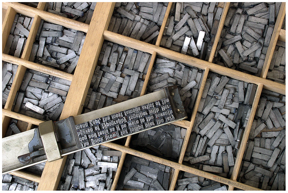
Movable type: from 11th century
Movable type (separated ready made characters/letters which can be arranged in the correct order for a particular text and then reused) is a necessary step before printing became an efficient medium for spreading information. As early at the 11th century, the concept was experimented in China. The problems were that Chinese script had too many characters that type-casting & type setting became too complex. Another is that Chinese printers cast their characters in clay and then fire them as pottery, making it too fragile for the purpose.
Type foundry in Korea: c.1380
In the late 14th century, Koreans established a foundry to cast movable type in bronze. Bronze is a strong medium for repeated printing, dismantling & resetting for new text. At the time, the Koreans still used Chinese script so they had the problem of a high number of characters. In 1443, this was solved when they invented their own alphabet, aka ashan'gul.
Saints & Playing Cards: AD c.1400
Around 1400, the technique of printing from wood blocks was introduced in Europe. Like in the east, the images were printed by the simple method of laying a piece of paper on a carved and inked block and then rubbing its back to transfer the ink. Like in the east, the main market is holy images for sale to pilgrims. Playing cards are another early part of the western trade.

Gutenberg & Western Printing: AD 1439 - 1457
The name of Gutenberg first appears, in connection with printing, in a law case in Strasbourg in 1439. Nothing in this period survived but Gutenberg was said to have been capable of printing small items of text from movable type which is done so in Strasburg. The next time Gutenberg is heard in relations to printing, he borrowed 800 guilders in 1450, Maine, from Johann Fust with his printing equipment as security.
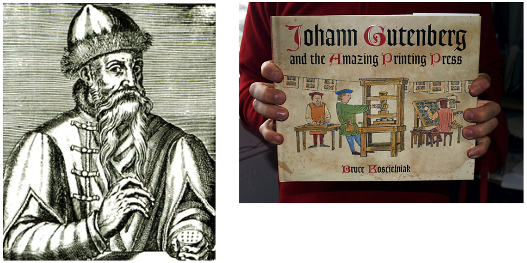
One of Gutenberg's development of the printing press, capable of applying a rapid & steady downward pressure. Gutenberg's skills with metal enabled him to master the complex stages in the manufacture of individual pieces of type, which involve creating a master copy of each letter, devising the moulds in which multiple versions can be cast, and developing a suitable alloy (type metal) in which to cast them. This skillful technology precedes the basic work of printing (arranging the individual letters, aligned and well spaced, in a form which will hold them firm and level to transfer the ink evenly to the paper).
In the Gutenberg Bible, there was no dates. It was printed simultaneously on six presses during the mid 1450s. At least one copy is known to be completed, with initial letters coloured red by hand in 24 August 1456.

Lecture 03: Typography Redux
Typography
To a graphic designer, typography is like oxygen. It is the most important area in graphic design to master to set ourselves up to good standards. It is the art of arranging & composing text. It also serves as a medium for expression and most importantly communication. In design work, it plays a central role.
In book design, our understanding & sense developed in the past two semesters will play a crucial role.
Characters in a typeface
- Small caps
- Numerals
- Fractions
- Ligatures
- Punctuations
- Mathematical signs
- Symbols
- Non-aligning figures


Legibility
To ensure that a body text is readable, the heeding established legibility guidelines is most important for this. To go out of these rules require a designer who is completely knowledgable of these rules. To make type legible, it is required to choose typefaces which are open & well proportioned.


With computers, there were many new features when it came to typesetting. However, this came with problems where people weren't aware of the typographic rules, which violates them at the expense of the reader. To ensure that type is legible, certain considerations have to be taken on.
- Underline: Many programmes carry out the underlining incorrectly as it should be lowered in order to not touch the characters as it affects readability. There is two types of underlines; one that focuses on each word, and another that focuses on the sentence as a whole.

- Small Caps & All Caps: Small capitals are good for subheads for the first line of a paragraph. Text set in All Caps should be used in short headlines or subheads. It is to note that All Caps are forbidden to be used for long sentences and for emphasis. Capital letters were meant to be punctuated instead of using as freely.

- Special-Purpose Style: Many formatting styles exist within softwares for making footnotes, references & mathematical formulas. These are usually embedded or nested within the tools sections and a normal user may not be aware.

- Text Scaling: Some programs allow for the creation of a pseudo-condense or pseudo-extended font by horizontally or vertically squeezing or stretching as font. This distorts the original design of the font, making it look cheap.

- Outline & Shadow: Another style that tends to be abused. It takes many years of experience before one can format text beautifully and effectively. For outline, it should not exceed 1pt. Be careful that shadows do not do away too far from the main text.

Text that flows harmoniously when read is achieved when a harmonious relationship exists between the type sizes, line lengths & spaces between the lines of type. Legibility impairment has no judgements and can even affect well designed typefaces. A column of type is usually about 50 characters and should have 65 maximum. If not, it would be too crammed and make the words hard to read.
Leading/line spacing refers to the amount of space between lines of type. As with type size, there are no set rules for how much line spacing to use. However, there are some factors to consider:
- The font used: Some require more line spacing than others to keep their ascenders and descenders from touching.
- The line length: Longer lines require more leading for easier reading
- The type size: The larger the type size, the more line spacing is require. This rule mostly refers to body copy; headlines which are normally larger set, may actually be set with tighter line spacing.
Overly long or short lines of type also tire the reader and destroys a pleasant reading rhythm.


Depending on the program used to format text, extra attention is needed. Larger type sizes require adjustments to the space between characters and paragraphs need to be adjusted to avoid widows and orphans.
Kerning: Inter-character spacing, aka kerning, creates a more pleasing look to the text. Most word processors do not allow kerning adjustments and most page-layout programs apply kerning adjustments and most page-layout programs apply kerning automatically. However, certain letter combos may need manual adjustments.

Tracking: It is similar to kerning but refers to the adjustment of a selection of characters, words and spaces. The main purpose if to make type fit a required space without altering the type size or line spacing. It can be negative or positive. An important use is to fix single words or the end of a paragraph.
Word spacing can determine the correct word spacing which includes the typeface chosen. Consistent spacing makes an even typographic "colour".

Italics: Should be used with prudence. Large amounts of slanted text impede reading. It is best used to create emphasis within text rather than to function as text.
Capitals: Consumes more space, and impedes the reading process. It lacks visual variety.
Alignment
Flush left, ragged right: Produces very even letter and word spacing. Since the line terminates at different points, it is easier to locate the new lines. It is the most legible of aligning text.
Flush right, ragged left: Works against the reader. Suitable for small amounts of text, but not recommended for large amounts.
Centred alignments: Give a very formal appearance and is good when used minimally. However, setting large amounts of text this way should be avoided.
Justified text: Can be very readable if its design ensured spacing between the words are consistent and that awkward rivers do not interrupt the flow of the text.
Paragraph Spacing
Paragraph space is an automatic space between each paragraphs. It can be placed above or below paragraphs. It is more elegant than simply double spacing returns.

Paragraph Indent
Indentation should be used if there is justified text. If there's usage of both indentation and paragraph space, it can be too much. If the type size is 10pts, the indent should also be 10pts.
Special Formatting
Hyphens are mainly used to divide words or numbers, but they can also be used to break words from one line to the next. Headlines and subheads should never be hyphenated at a line ending.

Often, lines need to be broken for readability. Just typing a return to break the line can alter formatting when the intention is to break the line. To avoid the problem, most programs allow line breaks (Shift+Return)

Drop caps are used to start off new chapters and special sections of a report. It should not exceed three lines. If the program does not have auto settings, they should be avoided.

DeskTop Quotes:

Side Bar:
It accompanies the main body copy. It highlights alternate narratives or facts.

Lecture 04: The Grid
Raster Systeme
The usage of grids as ordering systems is the expression of a certain mental attitude which showcases how a designer produces their work in terms which are constructive.
The grid divides a two-dimensional plane into smaller fields or a three-dimensional space into smaller compartments. The compartments maybe the same or different in sizes.
The Purpose of the Grid
The grid used by designers are able to solve visual problems. By arranging surface and spaces in the form of a grid, a designer is able to favourably place texts, photographs and diagrams in a coherent and functional matter.
This creates a sense of compact planning, intelligibility and clarity. It also suggests orderliness when it comes to the practice of design.

Modular
The grid is modular in nature, but is not to be a constraint. It does allow for flexibility; if the designer is able to see a multitude of combinations.
However, a limit must be set to maintain an amount of continuity or coherence in its outlook & navigation. A lot of this depends on the contents within the book as the contents of each book can have different ranges. A grid allows for systemising the information in such a way that it becomes easy to read & understand.
All publication consist of 3 major elements:
- Type
- Colour
- Image
Holding these three together are format and grids.
Variation
A designer should create variation within the layout but maintain consistency throughout the book. This entails keeping certain areas fixed; hang line, typeface, colour, image styles and such, while creating variation in combination of elements and variation within how it is arranged.

In the above image, the variation is created within the grid system. However, this does not mean every page requires a different variation, as they can be reused and rotated.
INSTRUCTIONS
For our book, we were tasked to write or source 3000 words of material. Below is the draft for my content.
Exercise 02: Mock-up Making
Week 02 (06/02/2022)
We were instructed to watch a video by Mr Vinod on how to carry out this exercise. We had to explore three sizes that are bigger than A5, but smaller than A4. For this exercise, I had prepared A3 papers, a stapler, a steel ruler, cutter and pencil.
Thus, I tried the following sizes:
- 278mm x 197mm
- 261mm x 171mm
- 240mm x 200mm

I ended up choosing the 240mm x 200mm option as I thought it looked and felt the best. After that, I proceeded to cut 8 pieces of A3 into my desired size. This allowed me to get 32 pages, which I bind together using a stapler.


For this exercise, we also did in Week 02's class. I had cut half of my A3 paper in order to carry out this task. First, I folded the paper according to Mr Vinod's instructions. Then, I labelled the paper with the page numbers.


After this, I stapled the middle to ensure the fold didn't fall apart when I cut the sides. Then, I cut the fold.


We were also instructed to follow a video provided by Mr Vinod on how to create a Van de Graaf manually with paper, a ruler and pencil as well as digitally on InDesign.


First, we were told to try out some existing grids, which I did as below:
After we got used to the grids, I tried making my own:
First, I did a B&W option. However.. I forgot to save it but do look @ Figure 2.6.2 for the coloured attempt of this version.
B&W Attempt #2:

Colour Attempt #1:

Colour Attempt #2:

Then, I got the below image from @xiuxiukong on Twitter.

Then, I thought I wanted to make the image black and white, which I did.

Then, I moved the image around the files using Colour Attempt #2..

Finally, I input text from my content generation to fit with the form & movement.

FINAL SUBMISSIONS
Exercise 01: Text Formatting
Exercise 02: Mock-up Making
Final Book Size: 240mmx200mm


Exercise 03: Signature Folding Systems (8+8=16)


Exercise 04: Classical Grid Structure


Exercise 05: Determining Grids
Exercise 06: Form & Movement Exercises


FEEDBACK
General Feedback: Be specific with the copyright. Remeber to reference everything, including sources, visuals, etc. In the next stage, look at visual references and research as much as possible. It was reminded to have a benchmark to achieve consistency throughout the book. When conceptualising your visuals, remember to not be so literal. Convey something beyond the literal expression and make it abstract.
General Feedback: When making a layout, if margin is equal on all sides, the book will end up looking rather plain. Ensure that the margins are visually dynamic in order to create aesthetic pages. For pullquotes, we were told that we can afford to be creative in the use of the pullquote and they function as imagery. The readability is not super important as if it's understandable, then it is fine. We were encouraged to watch the Redux lecture to learn formatting better. He also told us all to be aware of the type of typefaces we use to avoid using display text as a body text. He encouraged the class to explore good references to learn how to make our work according to the style we aim for. ex: edgy, classy, etc. To quote him, "If you are exposed to mediocre work, then you will do mediocre work."
Specific Feedback: My first attempt of my determining grids isn't particularly handsome. Mr Vinod instructed me to make it more dynamic by leaving more white space @ the bottom so that I could have more space to play with. When he looked at my second try, he mentioned it looked better. However, my other two looked too similar. He stated my pt size looks okay, but the heading is too big as it could be cut into half.
REFLECTION
Overall, this experience was very interesting. I had always wondered how books were made and this gave me some insight as to how they were designed and even printed. Even during my high school days, I would look at the novels I owned and wondered how they were binded. Though I never fully looked into it. Sure, "You" had somewhat given a knowledge how to repair books, but there was never any knowledge provided as to how they were printed, how many pages a book needed, etc.
With this task, I observed a lot of things about publishing! I looked at a lot of references, especially for the grids as I wasn't sure how to make an intriguing one at first. Thus, Pinterest was and is still truly my best friend as I was able to observe other designers' really good works.
I was able to find out a lot about the world of publishing through these exercises. I was also able to find out that a lot of good looking layouts required movement and form to be aesthetically pleasing to the eye.
FURTHER READING
We were instructed by Mr Vinod to read his article from Kreatif Beats, and that I did.

The form and movement exercises provided some playing towards students where they could learn more about design and get more control of design.
To see the process of some students as well as Mr Vinod provided more insight as to how other individuals had carried out this exercise before. It also felt like I was getting my eyes pulled open to see so many new interesting ways of making form move.

REFERENCES & PICTURE CREDITS


