Publishing Design: Task 03(B)
WEEK 09 - WEEK 14 (25/10/2022 - 29/11/2022)
Adena Tan Sue Lynn (0345769) / Bachelor of Design (Honours) in Creative Media
Publishing Design
Task 03(B)
DIRECTORY
- Lectures
- Instructions
- Final Submission
- Feedback
- Reflection
- Further Reading
- References & Picture Credits
This task coincides with Brand Corporate Identity: Task 04.
Layout Inspiration
Before doing anything, I went to find some inspiration from Pinterest. I used it to find qualities I thought would be suitable for the Sobuya brand, as well as find out more about Brand Guidelines as a whole.

Once I had compiled a few which I liked for Sobuya, I narrowed it down to a few.


From the three above, I liked the usage of grids the most, with a clean look. I figured that this would be the most suitable for Sobuya's clean and modern look.
Format + Grid System
For this task, we were given a set of dimensions to be used in the task; 1366 x 768. Thus, I went on and tried to create a grid system for it. Below are the four which I had played around with.
Then, I experimented with these grids using different layouts and styles.
Without Grids:
With Grids:
In the end, I chose the third grid option as I thought it looked the most intriguing and was the best option layout wise.
Below are the measurements which I used for the above layout.

Refined Layout
After getting feedback from Mr Vinod regarding my navigation system, I opted to make one which was more rounded, yet would still fit the grid system I had chosen to take on. Thus, below are the two which I had tried.


As I was using a more column and boxy feel, I knew I had to implement my navigation to fit those standards. Thus, I tried both of these out. For the one on the left, I knew it was the one, as it provided visual movement to the boxes instead of having them stagnantly repeated like in the right version. It also felt edgier to me, making me choose it as I just didn't like how safe the one on the right felt... (hehe..)
After nailing down my navigational system, I went on to create the document until the end of the first chapter (minus the first chapter as I felt I wasn't ready for it). Below is the version with no colour.
Then, I input colour for the slides. The below slides has the PDF Interactive function. If you would like to test it out, please download and view on Google Chrome.
Finding Images for the Guideline
After receiving Mr Vinod's and Ms Lilian's feedback to improve on the imagery, I knew I had to start a Pinterest board dedicated to Sobuya, alongside my existing Pinterest board for food.


Working on the Brand Guideline
After I had received my feedback in Week 11, I opted to focus on finishing my layout before tinkering with anymore interactivity. Below was my version after I had showcased it to Ms Lilian and edited it within the few hours I had before Mr Vinod's class. (Feel free to download and view in Google Chrome)
After I had received feedback on my work from Mr Vinod, I fixed my contents as well. Next, I tried to make forward and back buttons for each page for easier navigation. Initially, I wanted to create < & > buttons, but I hated how they looked, so I opted for the Sobuya shell.


Below is the updated navigational system.

To ensure all navigation worked properly, I opted for the bookmark options (for all buttons except the forward and backwards buttons) as I wanted it to be precise. Below showcases all the bookmarks I had for the document. The numbering system was to make my own life easier as when selecting it in the buttons tab, it arranges all the bookmarks alphabetically.

I also made sure to make the PDF more interactive with the button rollover feature with pictures zooming in, colour changes, images appearing, etc. Below is a more in-depth list of what I included.
1. Colour Changes
2. Information Pop Ups
3. Image Zoom Ins
4. Hyperlink Rollovers + Images Appearing
5. Image Changing
Finally, after I thought I was done, I exported my 2nd last version to check if everything was fine. (It was not, I had to fix some issues which I caught).
FINAL SUBMISSION
Complete Thumbnail Layouts


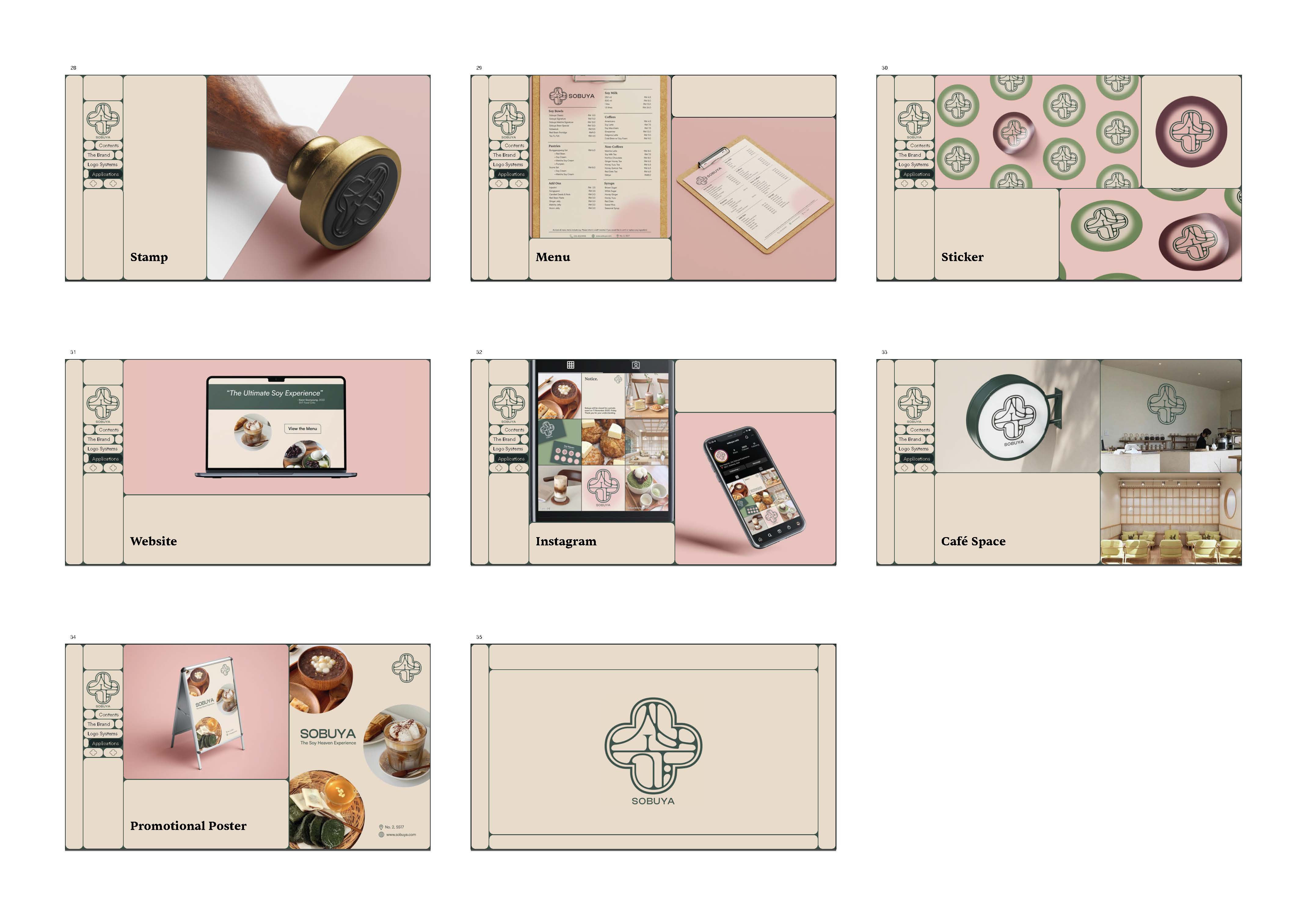
Final Brand Guideline, PDF Interactive
*Document is best viewed downloaded and on Google Chrome.
Final Brand Guideline, JPEG


FEEDBACK
Week 10 [01/11/2022]
General Feedback: Exploration of navigation menu would be best. Instead of just placing in the edges, try any other methods that would allow for something new but at the same time, does not interfere a lot with the larger layout. The navi is equally important as the layout. If it doesnt interfere, it may end up looking generic and as a website. However, it cant compromise the function.When introducing logos into the document, do it in a tactile manner so to avoid making it look over-graphical. It is recommended to provide tactivity (sensation of texture) within the larger layout the way information is presented. While it is not possible in every page, it does create emphasis when needed. It is also reminded that the identity has to be constantly seen. Mr Vinod informed us that some brands have different typefaces for print & web as not all typefaces are web/print safe. Within the interactive document, remember to maintain line lengths & ragging. If changing, there must be good reasons as to why. Avoid placing headline in the middle of the page as this means visuals have to be forced to only the lefts or rights.
Specific Feedback: My initial layout which I shown was called, "one hell of a boxy layout." Mr Vinod mentioned Spotify as an example of a rigid layout. He also reminded me to place an indication of where the visuals would be. For one of my layout + navigation, Mr Vinod said that I could replicate it across different pages, provided that it is supportive of the identity. It has potential but can be dangerous as it may fall in the rigid scope. He also reminded me to align my lines for coordination. Finally, he stated that my gradient idea could work, but it would be boring.
Week 11 [08/11/2022]
Specific Feedback: Choosing images have to be better. be very selective of messages. Need to be similar for the art direction. the one in visi misi is just the right tone. colour correct or overlay the other images so that the colour grade is about the same. Pictures can be conceptual for the chapter beginning but for the rest it can be "what you see is what you get". Good direction now.
General Feedback: Once completing all the layouts, only then do you link it to the relevant to avoid headaches. ensure that navigation files, think about how it can be done. finish off layouts first before introducing the connections. Since there's different amounts of text, can try to have tight margins that would be consistent. If you always keep having large margins, there's no commitment within the design. We must think of the reader who might accidentally press other buttons if they are too small or too cramped. Remember to not put your name in the cover. Screen reading is different from reading on print. The minimum for online is 16pts (equivalent to 8pts in print). Ensure that it is not too tight. Look for areas so that the layout can be expanded (look wise, not size wise). Can ask self if there's need for textures within plainer elements to give certain feels. For a brand, remember to have three 'flavours': light, mid & dark tones. Ensure to read a book about branding to have the ability. This task is not just about layout, have to think about the navigation and the function of the E-Book.
Week 12 [15/11/2022]
General Feedback: Ensure that PDF files aren't too big when uploading. It is not advisable to have two sans-serifs. There is also no need to tell people what the logo is typeset in as you wouldn't want people to type it out. It is important to choose a typeface that works well with your logo.
Specific Feedback: I should have a way to start from the home page, by using a button. Mr Vinod advised me to make the whole experience more interactive so readers will try to interact with the whole document. He mentioned that my rollover is good, but using the pink makes it look like it disappears, forcing the reader to have to register what they see. The pink idea would be okay if it was an already visited, but even then, it would need to be a bit darker. I should have a set amount of variations, so that there is variation but consistency throughout the PDF. Mr Vinod also helped me understand more about the things I should have improved on, content wise such as the logo's space rationalisation as well as the patterns.
REFLECTION
Experience
Overall, this experience has been very interesting! Before this, I had always wondered what the Interactive option meant for PDF exports as I had absolute zero idea how they were created. It's really interesting to learn and see how a PDF turns interactive, with all the buttons.
Observations
For me, I learn when I see others' work as well. I think I learnt so many interesting ways to vamp up the navigational system from my classmates, especially Adeline and Lene who both used an ellipse system which I had never considered to use for mine, but was an interesting way to learn that I could do that if I pleased!
Findings
From this task, I've definitely learnt to incorporate my previous knowledge from the previous tasks + typography modules to create an effective brand guideline which utilises the interactivity feature. During this task, I kept looking back at my older task to remind myself of the requirements to create a properly designed document. I think everything before was a real step-by-step which finally led to this outcome, which I'm happy with!
FURTHER READING
For my further reading, I decided to take a look at a book which I haven't looked at in ages, Typographic Design: Form & Function.

Since this task revolved around PDF's and on-screen text, I decided to head to Chapter 07 which explains more about typography on screens. As we are doing an interactive PDF, I decided to focus on Pages 131 & 132.


With the above pages, I was able to learn more about on-screen typography. It gave me a basic insight as to how things flowed on different types of screens and how they're used.
For the first page, the page was able to teach a bit of knowledge and history regarding type on modern screens. Some parts, I never knew so I found it quite interesting to read a bit of history to allow me to appreciate how far things have come!
I was more intrigued with the Responsive Design subtopic as it served as good reminders for this task. For example, the reminder that designers have to expect the document being viewed in different types of screens, which is what Mr Vinod has reminded us throughout the classes, but was a good reminder, nevertheless.
REFERENCES & PICTURE CREDITS


