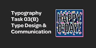
Typography Task 03(B): Type Design & Communication
29/10/2021 - 19/11/2021 (Week 10 - Week 13)
Lectures
Lectures 01 - 05 are in Typography Task 01: Exercise.
Lecture 06 is in Typography Task 02: Typographic Exploration & Communication.
Week 10 (29/10/2021)
During this class, Mr Vinod briefed us on this task.
Task 03(B) is to create a Typographical Telegram Sticker which consists of a greeting. (Happy New Year, Happy Pride Day, etc)
- Use the ten typeface provided
- Sticker is required to be a PNG without background.
- A white outline of 7pt is needed for legibility, no matter what messaging background the user has.
- Minor graphical elements are allowed.
- Black & White has to be approved before continuing.
- Text MUST be legible and must use as much space as possible.
- For submission, there must be PNG, PDF & GIF.
Instructions
Task 03(B): Type Design & Communication
Sticker Research
As I have never really created a sticker seriously, I decided to look at some of the stickers which I've downloaded which contains some form of type. I refrained from looking at stickers that I had made (Took photos from the internet, and processed them through an app to create reactions easier).

Even though these stickers have more graphics than required for this specific task, I was able to take note on some things:
- The border surrounding the type allows for easier readability, even with my WhatsApp background which has a wide variation of colours.
- The style of the border also gives off a different vibe to the overall sticker. The 'NOTED' sticker feels quite basic as it looks to have sharp corners and follows the letter's typeface well, in comparison to the Rilakuma 'Thanks' sticker which has a cuter look with its' rounded corners.
- Legibility and size is super important to convey a certain message. On my phone screen, the stickers are easily read when its in my hand. However, when it is further away, the Rilakuma sticker & the Good Night sticker are harder to read.
Sticker Sketches
Before sketching, I was stuck in between 'Happy Birthday' & 'Happy Mother's Day'. So, I just decided to sketch to see how my ideas would look like before fully committing to the greeting.

The sketches in Figure 2.2.1 are explained as follows:
- Top left: In the time of the pandemic, I wanted to try and showcase how we celebrate it nowadays, through screens.
- Top right: Inspired by party poppers & confetti, which is highly associated with birthday parties. Also inspired by this scene from ひとりじゃない's music video.
- Bottom: With birthdays, usually comes some gifts! I liked how the words somewhat framed the words and forced it to conform.

The sketches in Figure 2.2.2 are explained as follows:
- Left: Initially, I got the idea in bed to create a flower using the letters "o" and "u". Then, I got the idea to add a pot.
- Right: Another variation of the same idea as above, but with the flower replacing the O in Mother's.
- Bottom two: Random tryouts to ensure the idea would work!
After getting Mr Vinod's feedback on my sketches, I decided to try digitizing the confetti idea, the gift box idea as well as the right Happy Mother's day idea. To create the borders, I was lucky to find this video which explained the process of creating the border. (Even though the tutorial was meant for printed stickers, I found it worked just as well for digital stickers!) Below are the explanations of each B&W version:

For the above digitization, I used the following:
- Typeface: Futura Std Heavy Oblique
- Flower Typeface: Futura Std Medium

For the above digitization, I used the following:
- Typeface: Univers Std Ltd 59 Ultra Condensed
- Tools for Graphics: Ellipse Tool & Pen Tool

For the above digitization, I used the following:
- Typeface: Univers Std Ltd 59 Ultra Condensed
- Tools for Graphics: Ellipse Tool & Pen Tool

For the above digitization, I used the following:
- Typeface: Univers Std Ltd 59 Ultra Condensed
- Tools for Graphics: Pen Tool
After receiving feedback, I created two more Happy Birthday stickers during the same class. Below are the two which I ended up creating. They were meant to look like they're inside a box.

For the above digitization, I used the following:
- Typeface: Univers Std Ltd 59 Ultra Condensed
- Tools for Graphics: Ellipse Tool & Pen Tool

For the above digitization, I used the following:
- Typeface: Univers Std Ltd 59 Ultra Condensed
- Tools for Graphics: Ellipse Tool & Pen Tool
After receiving feedback again from Mr Vinod, I proceeded to create versions where the box's lines extended, creating a deeper box.

For the above digitization, I used the following:
- Typeface: Univers Std Ltd 59 Ultra Condensed
- Tools for Graphics: Ellipse Tool & Pen Tool

For the above digitization, I used the following:
- Typeface: Univers Std Ltd 59 Ultra Condensed
- Tools for Graphics: Ellipse Tool & Pen Tool
Overall, among all the Black & White versions I had created, I preferred Figure 2.3.7 the best. I thought the typeface suited the expression nicely. When paired with rounded borders, I liked how it softened the sharp edges of the typeface well. As for the graphical elements, I liked how the confetti seemed to be collaborating with the letters, as some of them touch the letters, and their borders are connected. Finally, I liked how the inside of the box looked without the strokes, and I felt it made it look cleaner and less distracting of a background.
Sticker Digitization - Colour
Firstly, I decided to look through some ready made colour presets to try and get a sense of a suitable colour palette for the sticker.
Initially, I looked through my Pinterest board, palette. However, none of the colour themes which I have pinned were suitable to me. Either they were too muted, or they didn't match the vibe I was going for.

Thus, I packed my bags and looked through Google, where I found a blog called seoulpalette.
Below are the coloured versions I did as well as the palette which I obtained from seoulpalette.


After colouring the sticker, I transferred them onto WhatsApp. I did this to see how it would look on a phone screen. [Besides the customized WhatsApp background, I have also included a screenshot with the normal WhatsApp background.]


Below are what I thought of the stickers:
- Figure 2.4.2 (Top right sticker): I thought this sticker was the most eye-catching. The confetti are still visible on the screen, even when the phone screen is an arm's length away. There also is a higher contrast when it comes to the confetti & the background. The dark blue in the background also nicely emphasizes the elements in the foreground nicely.
- Figure 2.4.4 (Bottom left sticker): I found this sticker to look quite... boring? Maybe it's because of the usage of pastel colours and the off-white border surrounding it. However, it's not as exciting of a sticker.
- Figure 2.4.6 (Top left sticker): This is my second favourite! I like how the red and blue looks from an arms length away. The dark blue in the background also nicely emphasizes the foreground nicely.
- Figure 2.4.8 (Bottom right sticker): The overall sticker feels slightly off for me. Maybe it's the way I coloured the background that could have been improved. However, I do enjoy the confetti, but it doesn't hit as nicely as Figure 2.4.2's.
As I kept looking between Figure 2.4.2 & Figure 2.4.6, I decided to try and combine them two together. This is because I wanted to take some colours which I preferred from the two. I also decided to create a rounded border around the box so that it would look more put together.


Overall, my favourite is definitely Figure 2.4.12's and I will be using it for my final product!
Creating Animated Sticker
Firstly, I initially tried installing the ZXP Installer and the Bodymovin-TG plugin. However, my system didn't allow me to, and prompted this message:

Thus, I decided I would just create a GIF animation. I tried to play around with Adobe After Effects and came up with the below one.

Altogether, I am not entirely sure what was the reason for my After Effects to distort it so much.. Maybe it was my very outdated system.... Anyways, I decided to try out the method learnt previously in Task 01: Exercises where we had created an animated GIF using Adobe Illustrator and Adobe Photoshop.
Below were the first few frames I created to make the gif.


After that, I created the top of the gift box for the animation to loop with more of an interesting feel.

I took the yellow shade from the yellow confetti from inside the box. Looking at it, the top of the box reminds me of the Swedish flag. (However, the Swedish flag has a brighter yellow, in comparison to this more mustard yellow shade.)
Then, I continued to make frames of the gift box sliding off to reveal the contents inside. For this, I used Figure 2.5.3 as my base.


Thus, I proceeded to combine them in Adobe Photoshop. Below is my GIF.


As the guideline for the animated sticker was to be no longer than 3 seconds, I wanted to ensure that it followed that. With the above screenshot, I managed to count that it would be 2.1 seconds long. However, to double check, I input the animated gif into the website, GIF Duration.

With the above result, I was able to conclude that the gif is definitely in fact, 2.1 seconds!
Uploading Sticker
Firstly, I decided to upload the stickers onto WhatsApp, because I perosnally, find it easier to do so. I input the static sticker & the animated sticker using the application, Sticker Maker.

Next, I moved on to Telegram. I knew my issue with the plug-in installing would refrain me from being able to upload it, however, I saw the '/newpack' option allowed for WEBP to be uploaded. With that, I went to Animated WebP Maker, to try and turn my GIF into a WEBP file.

However, this method did not work, but it was worth the try!


With that, I decided to just upload the static version.

Final Submission
1. Black & White Option

2. Coloured Option

3. PDF
4. Gif Sticker Animation

5. Screen Grab
Link to download Telegram static sticker: https://t.me/addstickers/AdenaHapDay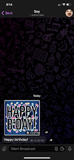

Feedback
Week 11 (05/11/2021)
General Feedback: Use the ten typefaces. 15% of the final outcome is the max allowed for graphics. When choosing colours, choose from the colour spectrum, to be able to learn more about using colours. Be careful with pastel shades as they might come off invisible when sent as a sticker. Make use of negative and positive space to create a balance.
Specific Feedback: Using a gift box as a container for the words is a good idea. Agreed that it's best to use Futura, Univers. Happy birthday with confetti could be integrated into it, where confetti appears out of the box. Don't forget to include the Taylor's logo.
Week 12 (12/11/2021)
General Feedback: Refrain from using too much graphic elements as it distracts from the type. Remember to loop animation sticker for the assignment. When submitting, remember to resize the still sticker to 2048px & the animated sticker to 1024px.
Specific Feedback: Remember to add an apostrophe (') for B'Day as it
is short form. If want to continue with gift box idea, it would be better to
reduce size of the first result, and add smaller outline, like it is inside
the box. Visualize colours & basic animation (no more than 3 seconds).
After showing the box version: Can extend the lines to make it more obvious
that it is a box, can either use lines or colour to represent the lines of
the box.
Reflection
Experience
Personally, I have never tried making a sticker, let alone one for messaging
applications like Telegram or WhatsApp. With that, I would say this task has
been extremely helpful for me to learn the beginnings of making a sticker
and the animated version of it. I had a lot of fun trying to come up with
ideas, and digitizing the stickers, so I can safely say that I am
tremendously grateful to have been given this experience.
Observations
While doing this task, I managed to observe some small things I never had
before. I observed size within the text and legibility within it. On a day
to day basis, I come across stickers that hold text, but never bothered to
look and think about how they came to be, what was the design process behind
it, why did they use this typeface, etc.. Now, when I do come across
stickers that have text, I'll definitely pay more attention to it than
ever.
Findings
I found the overall sticker making process to be an interesting one. From
trying to figure out the content, to digitizing it and to animating it, it
was very surreal and beyond my expectations for what I could do. I
definitely found it more interesting than I imagined, with trying to find
the perfect balance of graphical elements as well as text, while also trying
to maintain the graphical elements to text ratio as provided by Mr Vinod.
Overall, I found the process tremendously helpful for future knowledge &
I believe I will be using this experience well in the future.
Further Reading
Firstly, I decided to try and obtain information from WhatsApp to read their recommendations for when creating a sticker. Below are some notes I took when reading the FAQ page about it.
- Each sticker should have a transparent background.
- Must be less than 100 KB.
- Stickers will be rendered on a variety of backgrounds. However, it is recommended to add a 8-pixel #FFFFFF stroke to the outside of each sticker.
- There should be a 16-pixel margin between the sticker image and the edge of the canvas.
Next, I decided to read 'Typography Referenced', a book recommended to be read by Mr Vinod.

For this, I decided to read Typography Selection's Display Type.

Typography Selection, Page 74.
In the above page, I took down some notes:
- Display type needs to quickly capture a reader's attention.
- Typographic size allows for attention to be grabbed. It asserts which allows for the competitive visual noise to be cut through.
- Display type must be legible.
- However, legibility may not be as crucial as with the type text used as viewers can decipher smaller amounts of text more easily.

Taking parts of these next few pages, I took down some notes for them as well:
- Eyes usually begin @ the top left and scans right and down, left and down, until it has reached the bottom of the composition.
- In the figure with the words E, V, I & L, it allows for viewers to read it two ways; LIVE & EVIL.
- Focal points can be created by using contrasts in size, shape, typeface, colour & texture.
Finally, I decided to read 'Typographic Design: Form and Communication'.

Firstly, I decided to read Chapter 06: The Typographic Message.

Chapter 06: The Typographic Message, Page 112.
- Other than being read & interpreted verbally, typographic messages allow for them to be visually & audibly interpreted.
- In Figure 6.1 of the page, the repetition of words allows for the type to signify sound.
- Dadaism & Constructivism artists & designers thought of typography as a powerful means to convey information.

- Typography must communicate as it is a representation of the spoken language.
- Receivers of a typographic message should get the idea of the transmitter, and then only would the role of typography would be achieved.
- Typography can influence contexts of social, political and economic events.
- Typographic signs can be manipulated in order to achieve more lucid & expressive typographic communication.

- Signs come together to create messages in language.
- Words can evoke meanings through mental association.
- For example, Figure 6.11 in the page has been created in such a way that it creates a form of a Christmas Tree.
- Typographic signs are verbal & visual. The associations formed between both are found in a variety of configurations which allows to reveal the associative nature of signs composing the message & help us further understand.
References
Carter, R., Phillip, B. M., Day, B., Maxa, S., Sanders, M. (2015). Typographic
Design: Form and Communication. New Jersey: John Wiley & Sons, Inc.
Haley,
A., Poulin, R., Tselentis, J., Seddon, T., Leonidas, G., Saltz, I., Henderson,
K., Alterman, T.. (2012). Typography Referenced. Rockport Publishers.
WhatsApp.
(n.d.). How to create stickers for WhatsApp. Retrieved from https://faq.whatsapp.com/general/how-to-create-stickers-for-whatsapp/?lang=en
Picture Credits
Figure 2.4.3 & 2.4.7 - https://seoulpalette.tumblr.com/post/185459538954/nct-dream-x-hrvy-dnyl-dont-need-your-love-mv
Figure 2.4.5 - https://seoulpalette.tumblr.com/tagged/color-palette
Figure 2.4.9 - https://seoulpalette.tumblr.com/post/618562986613833728/nct-127punch-mv


