Typography Task 01: Exercises

27/08/2021 - 24/09/2021 (Week 01 - Week 05)
Adena Tan Sue Lynn / 0345769 / Bachelor of Design (Honours) in Creative Media
Task 1 / Exercises
LECTURES
What is Typography?
Typography is the act of creating letters/type frames. We can find them everywhere around us. Examples are animated forms, website design, application design, signage design, product labels and logotypes.
Oxford definition: The style & appearance of printed matter.
Wikipedia definition: The art & technique of arranging types to make written languages legible, readable & appealing when displayed.
Applying to my daily life, I noticed this is many things that I love. For example, Seventeen's logotype for their album, 헹가래. The designer had cleverly designed the Korean characters to intersect one another, and makes the overall look very intriguing to analyse.

Calligraphy
Next, the difference between calligraphy & lettering was established. Calligraphy is to be written, whereas lettering is to be drawn.1. Black Letter Calligraphy

2. Informal Calligraphy/Penmanship

Typography Terminology
Font: Refers to individual fonts/weights within a typeface
Typeface: Refers to the entire family of fonts


Lecture 1: Development
Early Letterform Development: Phoenician to Roman
- Initially scratching into wet clay/carving into stone.
- Uppercase letterforms evolved from these tools & materials
- At its' core, uppercase forms are simple combinations of straight lines & circles.

- Greeks changed the direction of writing. Phoenicians wrote from the right to left, but the Greeks created a style of writing called 'boustrophedon' which means 'how the ox ploughs'. The style consisted of words being read from left to right and right to left with no use of letter space or punctuation.

- Etruscan (& then Roman) carvers used to paint letterforms onto marble before inscribing them. This was due to the value of marble. Certain qualities of the carvers' strokes carried over into the carved letterforms.
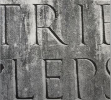

- Found in Roman monuments, square capitals were the written version. These letterforms have serifs added to the finish of the main strokes. Variety of strokes width were achieved when the reed pen was held at an angle of approximately 60 degrees off the perpendicular.

- Rustic capitals are a compressed version of square capitals. They allowed for twice as many words on a sheet of parchment and took less time to write. The writing instrument was held at an angle of approximately 30 degrees off the perpendicular. Despite being easier and faster to write, they were slightly harder to read due to the compressed nature.

- Both capitals were typically reserved for documents of some intended performance. As for everyday transactions, they were typically written in cursive which was utilized for speed. Here, we can see the beginning of the lowercase letterforms.

- Uncials incorporated aspects of the Roman cursive hand. These were particularly obvious in the shapes of A, D, E, H, M, U, Q. 'Uncia' in Latin means the 'twelfth of anything'. As a result, some scholars think that uncials refer to letters that are one inch high. However, it might be more accurate to think of uncials as small letters. Broad forms of uncials are more readable at small sizes than rustic capitals. Uncials did not have lowercase or uppercase forms.

- Half-uncials were the further formalization of the cursive hands. They marked the formal beginning of lowercase letterforms, replete with ascenders & descenders, 2000 years after the origin of the Phoenician alphabet.

- Charlemagne, the first unifier of Europe since the Romans, issued an edict in 789 to standardize all ecclesiastical texts to avoid misunderstanding of texts. Alcuin of York, Abbot of St Martin of Tours, was trusted with this task. The monks rewrote the texts using majuscules (uppercase), miniscule, capitalization as well as punctuation which set the standard of calligraphy for a century.

- With dissolution of Charlemagne's empire came regional variations towards Alcuin's script.
- Nothern Europe is where a condense strongly vertical letterform known as Blackletter or textura gained popularity. As for Southern Europe, a rounder more open hand called 'rotunda' gained popularity. The humanistic script in Italy is based on Alcuin's miniscule.

- Gutenberg's skills included engineering, metalsmithing & chemistry. To build pages that accurately mimicked the work of the scribe's hand, he marshaled them all. Blackletter of the northern Europe. His type mold required a different brass matrix, or negative impression for each letterform. Developed a system to print quickly.

Describing Letterforms
Typography employs a number of technical terms. They describe specific parts of letterforms. Knowing them will make it much easier to identify specific typefaces.
Baseline: The imaginary line of the visual base of the letterforms
Median: The imaginary line defining the x-height of the letterforms
X-Height: The height in any typeface of the lowercase 'x'

Stroke: Any line which defines the basic letterform. Best way to remember letterform is a stroke.

Apex/Vertex: The point created by joining two diagonal stems.

Arm: Short strokes off the stem of the letterform. It can be either horizontal or inclined upwards.

Ascender: The portion of the stem of a lowercase letterform that projects above the median.
Barb: The half-serif finish on some curved strokes.

Beak: The half-serif finish on some horizontal arms.

Bowl: The rounded form that describes a counter. The bowl is either opened or closed.

Bracket: The transition between the serif & the stem

Cross Bar: The horizontal stroke in a letterform that joins two stems together

Cross Stroke: Horizontal stroke in a letterform that joins two stems together. (Usually in lowercase f & t)

Crotch: The interior space where two strokes meet

Descender: The portion of the stem of a lowercase letterform that projects below the baseline.

Ear: The stroke extending out from the main stem or body of the letterform
Finial: The rounded non-serif terminal to a stroke.

Leg: Short stroke off the stem of the letterform, either @ the bottom of the stroke, or inclined downward.

Ligature: Character formed by the combination of two or more letterforms.

Link: Stroke that connects the bowl & the loop of a lowercase g.

Serif: Right-angled or oblique foot at the end of the stroke.
Shoulder: The curved stroke that is not part of a bowl.

Spine: The curved stem of the S.
Spur: The extension that articulates the junction of the curved and rectilinear stroke.
Stem: Significant vertical or oblique stroke.
Stress: Orientation of letterform, indicated by the think stroke in round forms.

Swash: Flourish that extends the stroke of the letterform.

Tail: Curved diagonal stroke at the finish of certain letterforms. (Q)
Terminal: The self-contained finish of a stroke without the serif. May be flat, flared, acute, grave, concave, convex, or rounded as a ball or a teardrop.
The Font
Uppercase letters: Capital letters, including certain accented vowels, the c cedilla & the n tildge, and the a/e & o/e ligatures.

Lowercase letters: Lowercase letters include the same characters as uppercase.

Small Capitals: Uppercase letterforms draw to the x-height of the typeface. Small caps are primarily found in the serif fonts as a part of what is called an expert set. Allows for non-disruptive bodies of text.


Lowercase Numerals: Known as old style figures / text figures, these numerals are set to x-height with ascenders and descenders. Best used when one would use upper and lowercase letterforms. Less common in sans serif type-faces than in serif. Originally the form that numbers used to take.

Italic: Forms in Italic refer back to fifteenth century Italian cursive handwriting.

Punctuation, misc characters: Can change with different typefaces. It's important to know with all the characters available before choosing the appropriate type.

Ornaments: Used as flourishes in invitations of certificates. They are usually provided as a font in a larger typeface family.

Describing Typefaces

Roman: The uppercase forms are derived from inscriptions of Roman monuments. Slightly lighter is referred to as 'Book'.
Italic: Fifteenth century handwriting on which forms are based. Oblique conversely are based on roman form of typeface.
Boldface: Characterized as thicker stroke than a roman form. Can be called semi-bold, medium, black, extra bold, or super, depending on the strokes of the typeface.
Light: A lighter stroke than the roman form. Even lighter, would be called thin.
Condense: Version of roman form, extremely condensed versions are called 'compressed'.
Extended: Extended variation of roman font.
Lecture 3: Text - Part 1
Kerning & Letterspacing
Kerning: The automatic adjustment of space between letters. Often mistaken as letterspacing. In figure below, left doesn't have kerning, whereas the right has kerning.

Letterspacing: Addition of space between the letters.
Tracking: The addition & removal of space in a word / sentence. Has normal, loose & tight tracking.


Text Formatting
Flush left: Closely mirrors the asymmetrical experience of handwriting. Each line starts at the same point, but ends whenever the last word on the line ends. Spaces between words are consistent throughout, allowing the type to create an even gray value. Flush left always has ragged right. Best used for Roman text for easy readability.

Centered: Imposes symmetry upon text, assigning equal value & weight to both ends of any line. Transforms fields of text into shapes & adds a pictorial quality to the material. It creates such a strong shape, so it is important to amend line breaks so that the text does not appear jagged. Should be used sparingly for smaller amounts of text.


Type that calls attention before reader can get to the words is interference. If you see the type before you see the words, change the type.
Texture
It is important to learn how different typefaces feel as they suit different messages. Good typographers knows which typeface best suits the message at hand.Consider the different textures of typefaces. Type with a generous x-height or relative heavy stroke produces a darker mass on the page than a type with a smaller x-height or lighter stroke. Sensitivity to these differences are fundamental for creating successful layouts.

Leading & Line Length
Type size: Should be large enough to be easily read at a arms-length
Leading: Text that is set too tightly encourages vertical eye movement. Type that is set too loosely creates striped patterns that distract the reader from the material.
Line Length: Appropriate leading for text is as much a function of the line length as it is a question of type size and leading. Shorter lines require less leading; longer lines more. A good rule of thumb is to keep line length between 55-65 characters. Extremely long or short lines lengths impairs reading.
InDesign Notes
Facing pages: Usually for books
Ctrl+Shift+Bigger than or Ctrl+Shift+Alt: Increase size of word
Ctrl+;: Turn off margin & columns
Alt+< / Edit>Preferences: Kerning
Alt+>: Increase spacing
Lecture 4: Text - Part 2
Indicating Paragraphs
There are several options for indicating paragraphs.
Below, we see the 'Pilcrow' which is a holdover from medieval manuscripts that are seldom used today.


Line Space VS Leading.

Below shows standard indentation. Typically, the indent is the same size of the line spacing or the same as the point size of text. Usually seen on newspapers, and best used when text is justified.

Below showcases the method of extended paragraphs which creates unusually wide columns of text. Despite these issues, there can be compositional / functional reasons for choosing. Sometimes used in academic material.

Widows & Orphans
In traditional typesetting, there are two unpardonable gaffes. These are widows & orphans. Designers must be aware to avoid the occurrence.
Widow: Short line of type left alone at the end of a column of text. Can be avoided by adding more words in the same line as the potential widow.
Orphan: Short line of type left alone at the start of a new column. Can be avoided by properly placing the lines, and checking the previous column.

Highlighting Text
Headline within text
Lecture 05: Understanding
Understanding letterforms
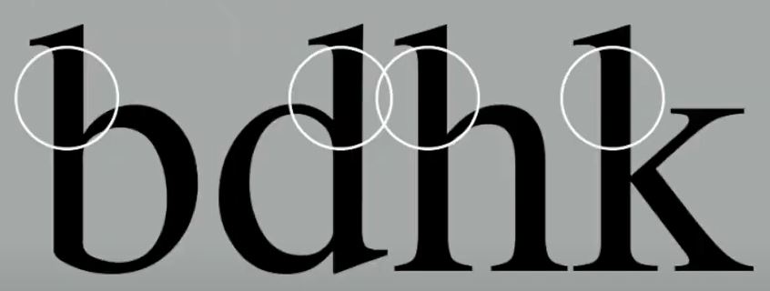
Uppercase letter form below suggests symmetry. However, it is not symmetrical. It is easy to see the two different stroke widths of the Baskerville stroke form; more noteworthy is the fact that each bracket connecting the serif to the steam has a unique arc.

Letters
Uppercase letter below may appear symmetrical, but a closer look tells that the width of the left slope is thinner than the right stroke. Both Baskerville (previous) & Univers (below) demonstrate the meticulous care a type designer took to create letterforms that are internally harmonious & individually expressive.

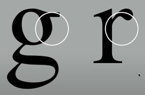
The complexity of each individual letterform is demonstrated by examining the lowercase "a" of two similar sans-serif typefaces: Helvetica & Univers. The difference in character between the two can be seen by how the stems of the letterforms finish & how the bowls meet the stems showcases the palpable difference in character between the two.

Maintaining x-height
X-Height generally describes the size of lowercase forms. However, curved strokes, such as "s", must rise above the median, or sink below the baseline, to appear to be the same size as the vertical & horizontal strokes they adjoin.


Counterform
Recognizing specific letterforms allows us to develop a sensitivity to the counterform. The space allows us to see how the strokes are described and contain the spaces.

Contrast
Typography also uses the basic principles of Graphic Design. Below are examples of typography using contrast.

INSTRUCTIONS
Exercise 01: Type Expression

- Terror
- Space
- Water
- Bark
With that, I came up with a few sketches to visualize my ideas clearly.
For 'Terror', I wanted to incorporate the feeling to fear people experience when they are faced with terror. Firstly, I tried sketching a terror with a big scary face with lowercase letters to emphasize the terror the O was experiencing. Next, I sketched a feeling of shiver onto terror, which made people shake in fear. Finally, I tried playing with the first idea and made the TERR_R capitalized and made the expression much smaller.

For 'Space', I first thought of outer space when sketching, which lead to the top two sketches. Both of them were to represent a planet and had an irony of having no 'space' as they were tied together. Next, I tried to think of how just space could be emphasized by the letters. The bottom left has the A spaced away from the SP and CE, looking isolated. The bottom right spaced out all the letters far away from each other.

For 'Water', I tried to think of how water lives in my mind. The first two thoughts were water drops and water waves. Then, I looked at my water bottle and imagined what it would look like if it fell all over my notes. I'd be extremely upset, but oh well.. It led to the water smudge idea.

Finally, for 'Bark', I kept thinking of all the ways a dog could be represented in the word. As I kept looking at my aunt's dog, I realized that the B sort of looks like a snout! I then added a nose and spots to try and further represent the dog. Then, I tried making another version but with more items that represents a dog like a bone and a ball. Finally, I looked at the A and changed it into a paw.


When receiving feedback, I noted down the feedback that I had gotten from Mr Vinod & Dr Charles. According to their feedback & suggestions, I altered "Terror" & "Water".

Type Animation
During 10/07/2021, we were given the chance to animate a gif for one of the chosen typefaces. Below was my first gif. It appeared to be bouncing before being pushed back into space.

My second tryout was somehow even more of a fail than the first. I had forgotten to align the "SP" and "CE", which made the words float up at the end.

Realizing that, I went back into Adobe Illustrator to fix the alignment. However, I found the ending to be a little awkward, as the space jumps out, and the 'slowing down' of the "SP" & "CE" to be a little jumpy.

Finally, I decided to follow the general feedback and implement it into my gif. I tried to make it reloop, and smoother. (Which was hard, as my Adobe Photoshop is so laggy.)

Final Submission


Exercise 02: Text Formatting
Work Process
To start, I watched the videos provided by Mr Vinod. I followed the first of the series, which was to learn how to carry out kerning & tracking. Below was me following his tutorial to learn kerning & tracking.
Then, I continued to watch his videos to further understand the process of text formatting. Below is what I produced. I made sure to cross-align the work.


The above version includes:
- Headline Typeface / Font / Font Size: Janson Text LT Std 75 Bold, 22pt
- Sub-Headline Typeface / Font / Font Size: Futura Std Heavy Oblique, 10 pt
- Body Text Typeface / Font / Font Size: Futura Std Book, 9pt
- Picture Caption Text Typeface / Font / Font Size: Futura Std Light, 8pt
- Text Leading: Heading (24pt), Sub-Headline (12pt), Body Text (11pt), Picture Caption Text (10pt)
- Characters Per Line: 55-70 (Too much)
- Alignment: Rivers (Left Justification)
Looking at the above, I knew I wanted to try to learn how adjust some things, especially the Characters per line, as I was too focused on adjusting the hyphenations in Version 01. I also adjusted my attempt of cross-aligning so that more lines would cross-align, rather than just two lines.


The above version includes:
- Headline Typeface / Font / Font Size: Janson Text LT Std 75 Bold, 22pt
- Sub-Headline Typeface / Font / Font Size: Futura Std Heavy Oblique, 10 pt
- Body Text Typeface / Font / Font Size: Futura Std Book, 9pt
- Picture Caption Text Typeface / Font / Font Size: Futura Std Light, 8pt
- Text Leading: Heading (24pt), Sub-Headline (12pt), Body Text (11pt), Picture Caption Text (10pt)
- Characters Per Line: 55-65
- Alignment: Rivers (Left Justification)
Looking at all my attempts, I found it safe to say I liked Version 04 the best. It allowed for the Headline to stand out, instead of the pictures. I also liked how the body text on the right column gave some breathing space at the top right. Next, the photos also flowed with the text, only starting when the column doesn't have anymore text to show, which makes doesn't force the readers to look at the photo.
Final Submission
FEEDBACK
Week 2 (03/09/2021)
Week 3 (10/09/2021)
Week 04 (17/09/2021)
REFLECTIONS
FURTHER READING


- Stroke-to-height ratio.
- Contrast in stroke weight.
- Expanded & condensed styles.
- X-height & proportion.


References


