Typography Task 02: Typographic Exploration & Communication

24/09/2021 - 08/10/2021 (Week 05 - Week 07)
Adena Tan Sue Lynn / 0345769 / Bachelor of Design (Honours) in Creative Media
Typography
Task 02 / Typographic Exploration & Communication (Text Formatting and Expression)
Lectures
Lectures 01-05 can be found in Typography Task 01: Exercises.
Lecture 06: Screen & Print
Different Medium
Screen platform usage has increased. However, screen addiction is a thing, which can cause developmental effects on the youth.
Paper medium has been decreased, but it will not go out of style. People used to believe that technology would get rid of paper usage. However, with technology, came printers, which in fact, has increased the usage of paper.

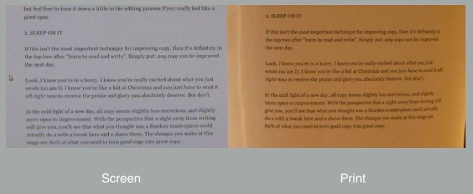
The below screen design is special for a multiple of reasons: It is bold, dynamic. It has good contrast and balance in the overall layout. It's easy to see how Typography is used thanks to it.

In the past, typography was only 'alive' when it was on paper. Once a publication was edited, typeset & printed, it was completed and nothing was ever changed. "Good typography & readability were the results of skilled typesetters & designers."
Typography exists on paper & screen. Our experience with typography changes with every page due to how it's rendered as typesetting happens in the browser itself. There are places where you can see that websites are more experimental, but it requires more coding. Coding can be quite taxing to learn, but most students have ongoing studies of basic coding.
Print Type
Type was designed for reading from print long before we read from screen. It is important to ensure that the text is constantly smooth, flowing & pleasant to read. Typefaces such as, Caslon, Garamond & Baskerville, are the most common typefaces that are used for print. This is due to their elegant and intellectual characteristics, which are also easily readable at a small font size. (However, this is not to say that other San-Serif typefaces are are not the same.) These neutral and versatile typefaces are easy-to-digest, which makes typesetting a breeze.


Screen Type
Typefaces for web are often optimized and modified to enhance readability & performance onscreen in various digital environments. Whether it be taller x-heights, wider letterforms, more open counters, heavier thin strokes & serifs, reduced stroke contrast & modified curves and angles. Type used to be modified for the clarity of the screen. Depending on the screens you view typeface on, it could differ. Typefaces such as Verdana & Georgia are created specifically for screens.
For typefaces intended to be smaller, it is important to have more open spacing. It improves character recognition & overall readability in the digital world (web, e-books, mobile devices).
Hyperlink / Hyperactive Link
A word, phrase, or image that you can click to jump to another document or another section within the current document. They are found in nearly all web pages, which allows users to click from one page to the next. Normally, they are blue and underlined. When one hovers their cursor over the hyperlink, the arrow will change into a small hand pointing at the link.
Font Size for Screen
A 16-pixel (px) text on screen is about the same size of text printed in a book / magazine. This accounts for reading distance. As we read books closely, they are usually set at 10 points (pt). If you were to read them at arm's length, you'd prefer if they were at least 12pts, which is about 16pxs on most screens. However, it can even be 20-24pts for screen usage (In pixels, it can be larger).
System Fonts for Screen
Every device has its' own pre-installed font selection. It is largely based on its operating system. With the invention of Google Fonts, it would automatically load irrespective if the device uses them. Nowadays, there are cross-platform typefaces and it is rarer to find typefaces with don't cross.
Web Safe Fonts: Open Sans, Lato, Arial, Helvetica, Times New Roman, Times, Courier New, Courier, Verdana, Georgia, Palatino, Garamond
Pixel Differential Between Devices
The screens used by our computers, tablets, phones as well as televisions are different sizes. Notably, they differ in proportion because they have different sizes pixels. 100 pixels on a laptop highly differ from 100 pixels of a 60-inch HDTV.

Static vs Motion
Static typography is known to have minimal characteristics in expressing words, but not necessarily true. Still can express, but it doesn't move. Traditional characteristics (bold & italic) offer only a fraction of expressive potential of dynamic properties. However, static design can be dynamic, as well.

Motion Typography
Temporal media offers typographers the chance to 'dramatize' type, for letterforms to become 'fluid' & 'kinetic'. Motion graphics increasingly contain animated type. Type is often overlaid into music videos & advertisements, which often has motion following the rhythm of the soundtrack. On-screen typography has developed to become expressive, which helps establish a tone. In title sequences, typography should prepare the audience by evoking a certain mood or feeling.
Instructions
Task 02: Typographic Exploration & Communication (Text Formatting and Expression)
Layout Research
First, to get a greater grip of what I should research on, I chose which editorial text I wanted to use. I chose the second text provided by Mr Vinod, which was titled, "Do Good, Be Good, Follow The Code".

Then, I decided to look at some existing Editorial Text layouts. This allowed me to get more ideas of how they look like.


From all the existing layouts I saw, I noticed two big things which would allow me to make better layouts later on.
- Columns are important for neater looking layouts
- Space can make a big difference in the layout.
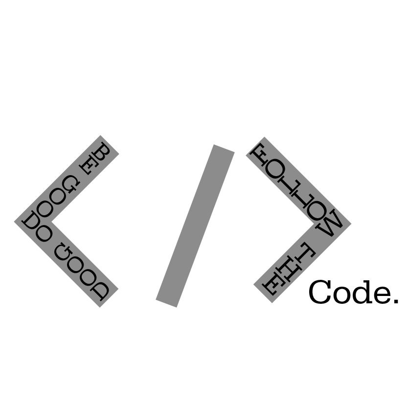
Next, I decided to look more into Code. "Follow the Code" is part of the title, which heavily reminds me of coding.

In the example above, there are things I notice within the layout. They are:
- Before we see code, we see the numbers by the side, which presents neatness and lines within the code.
- In lines 1-12, we can also see the characters, '<' and '>' frequently used together. Occasionally, it also has '/' in between.
- There are also a number of '=', '( )', '[ ]', '{ }' and ';'.
Layout Sketches
Firstly, I sketched some layout ideas with Medibang Paint Pro. I tried recreating a 4x4 layout to try and make it easier for my future self to digitize the layout into Adobe Indesign later on. My original idea with the layout of the text was for it to be as 'following' as possible, as if the words were following some rules, just like the title suggests.


After receiving feedback, I decided to sketch more layouts to try and get a better headline. I based it off my sketch in Figure 2.1.3. Following my research, I tried to focus more on the 'code' aspect of the title.


After drawing the layout sketches, I proceeded trying to figure out ways to use the '< / >'. Below are sketches of me trying to fit 'Do Good, Be Good, Follow The Code." into it.


The above sketches let me brainstorm the different ways I could fit the title into the '< />'. It was interesting to see how I could read it, but still try to maintain the words itself.
Following the layout sketch in Figure 2.1.2, I started trying out the layout in Adobe Indesign.


The above version includes:
- Headline Typeface / Font / Font Size: ITC Garamond Std Bold, 48pt
- Body Text Typeface / Font / Font Size: Univers LT Std 65 Bold Oblique & 55 Roman, 9pt
- Text Leading: Heading (50pt), Body Text (11pt)
- Characters Per Line: 55-85 (Too much)
- Alignment: Rivers (Left Justification)
After that, I wanted to try to make it more symmetrical. Thus, I played around with the layout more.


The above version includes:
- Headline Typeface / Font / Font Size: ITC Garamond Std Bold, 48pt
- Body Text Typeface / Font / Font Size: Univers LT Std 65 Bold Oblique & 55 Roman, 9pt
- Text Leading: Heading (50pt), Body Text (11pt)
- Characters Per Line: 55-85 (Too much)
- Alignment: Rivers (Left Justification)


The above version includes:
- Headline Typeface / Font / Font Size: Univers LT Std 93 Extra Black Extended, 48pt & 74pt
- Body Text Typeface / Font / Font Size: Univers LT Std 65 Bold Oblique & 55 Roman, 9pt
- Text Leading: Heading (50pt & 74pt), Body Text (11pt)
- Alignment: Rivers (Left Justification)
While doing the above layout, I played around with the layout and came up with the below. However, this one had m,any issues. One of them being that there isn't proper cross-alignment. Another is that I did not manage to fit all the text into the layout.


The above version includes:
- Headline Typeface / Font / Font Size: Bodoni MT Bold, 107pt, 60pt & 48pt
- Body Text Typeface / Font / Font Size: Univers LT Std 65 Bold Oblique & 55 Roman, 9pt
- Text Leading: Body Text (11pt)
- Alignment: Rivers (Left Justification)
Next, I decided to try the layout sketch in Figure 2.1.3 as it would fit the requirements of the characters per line as Layout 01 did not have the proper adjustments.


The above version includes:
- Headline Typeface / Font / Font Size: ITC Garamond Std Bold, 48pt
- Body Text Typeface / Font / Font Size: Univers LT Std 65 Bold Oblique & 55 Roman, 9pt
- Text Leading: Heading (50pt), Body Text (11pt)
- Characters Per Line: 55-65
- Alignment: Rivers (Left Justification)

The above version includes:
- Headline Typeface / Font: Serifa Std, 55 Roman

The above version includes:
- Headline Typeface / Font: ITC New Baskerville Std, Bold Italic
I found it hard to follow my previous sketches as I found it hard to fit in the words as opposed to my handwriting. I wasn't satisfied with the above Headline Tryouts, which made me realize that I needed to find a better way to make the headline appear more even. Then, I decided to try and put the code outside of the "< >" which drew more attention to it, by itself.

The above version includes:
- Headline Typeface / Font: Serifa Std, 55 Roman
I noticed by doing this, it appeared more even. Below are a few more attempts of making them look even.
The above version includes:
- Headline Typeface / Font: Serifa Std, 55 Roman

The above version includes:
- Headline Typeface / Font: ITC Garamond Std, Bold & Ultra

The above version includes:
- Headline Typeface / Font: ITC Garamond Std, Bold & Ultra

The above version includes:
- Headline Typeface / Font: Univers LT Std, 63 Bold Extended
I settled with Headline 03 Version 04. I thought it had the best line spacing among the five versions. I also thought it looked the most neat and even.
With that, I proceeded to input them into the Text Layout.


The above version includes:
- Headline Typeface / Font / Font Size: ITC Garamond Std Bold & Ultra
- Body Text Typeface / Font / Font Size: Univers LT Std 65 Bold Oblique & 55 Roman, 9pt
- Text Leading: Body Text (11pt)
- Characters Per Line: 55-65
- Alignment: Rivers (Left Justification)


The above version includes:
- Headline Typeface / Font / Font Size: ITC Garamond Std Bold & Ultra
- Body Text Typeface / Font / Font Size: Univers LT Std 65 Bold Oblique & 55 Roman, 9pt
- Text Leading: Body Text (11pt)
- Characters Per Line: 55-65
- Alignment: Rivers (Left Justification)


The above version includes:
- Headline Typeface / Font / Font Size: ITC Garamond Std Bold & Ultra
- Body Text Typeface / Font / Font Size: Univers LT Std 65 Bold Oblique & 55 Roman, 9pt
- Text Leading: Body Text (11pt)
- Characters Per Line: 55-65
- Alignment: Rivers (Left Justification)
Then, I decided to record all my digitizations to reflect and choose the best one for submission.


Overall, after looking at all my Layouts & their versions, I decided my favourite was indeed, Layout 03, Version 03 (Third row, third column). It had the most balance among the layouts and had an interesting mash of simple graphics and text. Not only that, but it has the most balance between both pages among all the other layouts.
Final Submission

Feedback
Week 06 (01/10/2021)
General Feedback: Remember to link the texts. Don't use two San Serif typefaces in the same layout. It is better to use the same ones, or use a serif typeface. Ensure that there is an even colour in your body text. Always ensure that cross alignment is achieved. Ensure that balance is achieved. Get hand motions (paper & pen, drawing tablets) involved when sketching layout as it allows cognitive development and ideas will be better. Maintain paragraph spacing. Better to not have distracting elements.
Specific Feedback: Overall, Tryouts 01, 02, & 04's line characters are not constant which makes Tryout 03 the best. In Tryout 03, it has good grey matter shape which is clean & clear. It has excellent typesetting with not many prominent rivers in the left justified. Evenness of colour makes it look like it's worth to be read. However, headline lacks idea expression. In examples shown to us: Headline leading to the body text can be good for flow .Headline doesn't require graphics, but can be used to support it. The headline and body text has to flow & look put together. Aligning small details can go a long way. Express ideas within the headline. Other than that, to ensure layout is well done when planning, flow the text into the pages, choose the typeface and font which was planned to be used, to see how much space the text requires.
Reflection
Experience
This task allowed me to learn more about trying to come up with better layouts for Editorial Texts. It also taught me how important columns are when formatting, and learn how to create more intriguing headlines than I expected I would be able to do.
Observations
In this task, I was given the chance to learn how to observe layouts, and ways they can be improved. I also was able to observe how important cross-alignment can be in layouts, and how they can tremendously tie everything together subtly.
Findings
After completing this task, I have a whole new respect for people who do this daily. I found creating good, balanced layouts to be harder than I thought they would be. The same goes for headlines, as I didn't think it was easy to create an eye-catching headline.
Further Reading
The Vignelli Canon
I decided to read 'The Vignelli Canon' by Massimo Vignelli, which was recommended by Mr Vinod. I retrieved it from the Typography Facebook group.

Throughout reading it, some pages stuck out to me. Below are the following.

Part One: The Intangibles, Page 12 & 13.
The line, "God is in the details.", had really stuck out to me. The line had allowed me to try and understand Syntactics on a deeper level, which was needed as I had never came across it before.
Syntax's definition is the grammatical arrangement of words to create sentences. However, in Design, it's done by many components from the project itself. In graphic design, grids are one of the important tools to achieve syntactical consistency.

Part One: The Intangibles, Page 16 & 17.
Discipline is to provide attention to the smallest of details. The text had taught me that every detail, no matter how small, is tremendously important as it contributes something to the overall creative process. It provides quality. If we have no quality in our work, we have basically just wasted our time.

Part One: The Intangibles, Page 24 & 25.
Visual power can be achieved in infinite ways. It can come from contrast which provides visually dynamic expressions. It can also come from delicate layouts or materials. It is something which can achieve effective designs, if given the proper attention it deserves.

Part Two: The Tangibles, Page 40 & 41.
Grid represents the overall basic structure of the design. Using it gives consistency, order and intellectual elegance. Can be used in many ways, but should be used wisely to achieve the best results. Below are examples of grids.

Part Two: The Tangibles, Page 42 & 43.

Part Two: The Tangibles, Page 48 & 49.
The above basically states that grids provides structure and continuity for a design of a book. The content the size of a book should be the first thing to be determined. A book with square pictures will be square.
Typographic Design: Form and Communication
Then, I decided to read 'Typographic Design: Form and Communication' which was also available on the Typography Facebook group.

Following the previous book I read, I decided to read Chapter 04: The Typographic Grid, to learn more about grids & layout.

Space is the common denominator for typographic communication. New structures can be formed by changing typographic elements by size, weight and position.

"A square subdivided into 256-unit grid of smaller squares displays an enormous range of proportional possibilities."

In the above page, I learnt that when text is a simple, linear narrative, it is best to set it as a single block. There's many ways to orient single text blocks to other spaces. These are related to budget constraints, standard paper sizes & the function of typographic information. A designer's intuitive can be improved by observing and practicing.
References
Vignelli, M. (2010). The Vignelli Canon. Lars Müller Publishers.
Carter, R., Phillip, B. M., Day, B., Maxa, S., Sanders, M. (2015). Typographic Design: Form and Communication. New Jersey: John Wiley & Sons, Inc.
Picture Credits
Carter, R., Phillip, B. M., Day, B., Maxa, S., Sanders, M. (2015). Typographic Design: Form and Communication. New Jersey: John Wiley & Sons, Inc.
Figure 2.2.1 - 2.3.25 - Personal Documentation


