Design Principles: Exercise 03

Adena Tan Sue Lynn / 0345769 / Bachelor of Design (Honours) in Creative Media
Design Principles
Exercise 03
Directory
Lecture
Harmony
- Involves selection of elements which have the same trait
- Without variety, it will become monotonous
- Sense that design fits together with the same theme, aesthetic & mood
Unity
- Repetition of particular elements to pull the look together
- Theme: elements composed in a balanced way & gives a sense of oneness

Scale & Proportion
- Size
- Scale: Size of objective in relation to other objects in design / artwork
- Proportion: Size of parts of an object
- Size & dimension
- Actual measurements
- Visual estimates

- Two or more elements in compositions
- Ratio
- Harmonious when correct relationship is produced
- Harmony & unity

- Sign/shape/object
- Coveys information
- Either Figurative or Non-Figurative
- Figurative > Visuals or Graphic Symbols
- Graphic Symbols > Pictorial / Abstract / Arbiatary
i) Image & Simplified Pictures
- Educational materials
ii) Looks like objects but less details
- Logo types
iii) No resemblance

Word & Image
- Imagery is important in design, whether it be digital or print. It is important to use suitable & relevant images when designing as viewers are able to relate to the concept if correct images are used.
- Choosing right words to pair with imagery is important as it can deepen the meaning of the design. Suitable typefaces & strategic positioning will result in visual hierarchy & balance.
- Typography is the design & arrangement of text to convey a message or concept.

Instructions
Exercise 03: Choose two (2) principles from Harmony / Unity / Symbol / Word & Image. Produce 1 design for each chosen principle.
I decided to choose Harmony and Word & Image.
Harmony
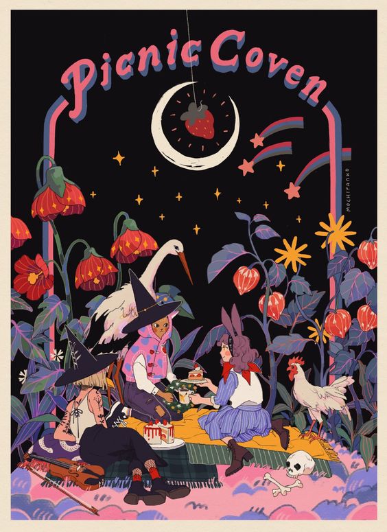
For Harmony, I felt very inspired by this artwork below for Harmony which was in Dr Jinchi's slides.

I also felt tremendously intrigued by this artwork which I found when trying to find design works for my notes.

With this, I knew I wanted to base my design on these two designs. With a nature based theme, with plants and some animals.
Before sketching, I was reminded of my bear that I did in Exercise 01 for Contrast. I wrote how it had found its' life purpose, to eat bright red fishes. Here, I wanted to showcase if the bear had no more fishes around! I wanted to make it show the bear's feelings, but also how it goes through the forest to find the one fish. I wanted the bear to sort of feel like the 'ground', whereas the stream and the flora stand above the bear.

After sketching, I started working on the final version of the bear. First, I focused on the crying bear. I drew its' outline using the colours I was planning to colour with. For this, I used both the Pencil & G-Pen in Medibang Paint Pro.

Next, I started filling in the colours.

I added shadows using the Airbrush tool to achieve a softer look.

After I was satisfied with the crying bear, I started working on the 'background' where the bear is chasing the fish through the forest.

I coloured it with the basic colour palette I had in mind,

After that, I focused on shading my bear. I also gave it a big polka-dot scarf. I also added some blush, paw details and it's mouth 'beard' detail.

Next, I changed the colour of the lines and added some shading onto the flora. Not only that, I also added some smaller flowers & lines to fill up more space.

Once I was satisfied with the flora, I continued with the river stream. I added some organic lines and shaded the river.

Then, I redrew the fish. I thought it would look nicer if the fish was drawn with the top view, instead of the side.

Finally, I added some small details like the strawberry seeds on the strawberry as well as the lines on its fins.

Final Submission

The Bear's Journey
The Bear has lost her red fish! Feeling sad, she cries, tears escaping her eyes uncontrollably. Then, she gathered herself and she realized something! She could get her red fish back by getting it with great efforts. This makes her go through high streams to catch her red big fish. Will she be successful in her journey? She's definitely on the way! The harmony is this piece is brought by the colours and how they fit together whilst also having variety.
Word & Image
For Word & Image, I tried looking through my Pinterest board for some inspiration. With that, I was able to identify some designs which allowed for both picture & text.
1. Magazine Cover

The above magazine cover showcases both text & image. It clearly tells viewers which magazine it is, who is on the cover page as well as who else is featured inside the magazine.
2. Tickets
Many might not pay attention to tickets, but tickets like the one above seem to be designed so beautifully. It clearly shows the date, time and place. It also showcases the works to be viewed at the Museum.
After looking into the two, I shall be doing a design based on a magazine cover.
Firstly, I thought of what to call my 'magazine'. Thinking, I knew it would be best to involve one of my online aliases; Soyakyn. What would my magazine have? I assume it would have a variety of things like fashion, recipes, etc, but they would all need to fall under a certain theme. In light of soy beans, which are vegan, I wanted the overall 'theme' to be plant-based lifestyle.
Now, I had to think of a subject to represent the "Image" part. At first, I kept thinking of Vernon from Seventeen as I had watched their In The Soop variety series. There was a part where Vernon was finding maple syrup for his french toast. I then, remembered that maple syrup is indeed vegan and would be a good fit for the magazine.
the way he freaks out while looking for the maple syrup 😭 his french toast isn’t complete without it #버논 pic.twitter.com/F2wkFmXRnx
— ً🤘🏻 (@hiraethhansol) September 14, 2021
Then, I started looking for photos of bottled maple syrup to reference.


While doing that, I also decided to look at more examples of magazine covers to get more ideas of how the layout flows.


First, I decided to work on the bottle. Below is my first sketch/outline of the bottle.


Thinking of a different 'logo' type for the maple syrup, I thought of 'Stardew Valley'! Sorry for the spoiler, but there is a bear in Stardew Valley who loves maple syrup.


After that, I added the bottle's 'brand', Boo's Maple. I got the Boo as I was ready for 'Spooky Season' which is October. I also shaded around the label.

Next, I started inputting the headline, sub-headlines and more to make the magazine cover. For the headline, I used the typeface 'Sporting Grotesque'. For the others, I used the typeface 'Omnes' but with different weights. I also made sure to add a darker version of the text behind it to make it easier to read.
To come up with the more topics in the magazine, these were my thought processes.
- Is faux fur eco-friendly? - I was reminded of my old faux-fur jacket
- 10 Easy Chickpea Recipes - I had a really good chickpea sandwich two weeks ago, and it was one of the best sandwiches of my life.
- Vegan Skincare Brands - I love skin care, and two of my favourite skincare brands are vegan.
- Ladies' Code's Ashley on her 30 Day Vegan Challenge - I was watching the Get Real podcast, and remembered Ashley's 30 Day Vegan Challenge series which I was very intrigued by.
- Saving The Earth - I needed something to try and balance the line... It came from how people say veganism can save the Earth.

Then, I added a bar code to make it more realistic. Finally, I also added a splatter to the background to add more depth to the cover.

Final Submission:

Soyakyn Magazine
Soyakyn is the classic vegan magazine. It promotes the vegan lifestyle. Always informing their readers on tips, tricks, benefits and so much more. For their September 2021 issue, they promoted Boo's Maple by promoting the benefits of replacing sugar with maple syrup. With their promotion, they're sure to make the image of Boo's Maple prominent on the cover, allowing it to take center stage. Not only that, Soyakyn is sure to inform potential readers more contents of the magazine on the side.
Feedback
Reflection
References
Picture Credits


