Design Principles: Exercise 01

Adena Tan Sue Lynn / 0345769 / Bachelor of Design (Honours) in Creative Media
Design Principles
Exercise 01
Directory
Lecture
Week 01


Instructions
Starting the live class, we were welcomed by Dr Charles. He had shared with us the Module Information Booklet (MIB) as well as briefed us of how our classes were going to be carried out. We were to watch pre-recorded lectures which are uploaded every Monday and present out progressions during the live classes.
Following that, I watched the pre-recorded lecture right after the live session had ended. Dr Jinchi explained everything very thoroughly and showed clear examples.
Visual Communication
- utilization of design to convey purposeful messages.
Elements of Design
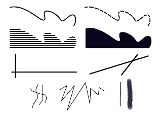
a) Point
a) Point
- Simplest element
- A line is formed when a point is used as a repetitive mark
- As points move in space, other 2D & 3D forms are created

Figure 1.1 Points
b) Lines
- Can be either active or static, aggressive or passive, sensual or mechanical
- Used to indicate directions, define boundaries, imply volumes/solids as well as suggest movement
- Can be grouped together to depict qualities of light and dark

Figure 1.2 Lines
c) Shape
- Expanse within the outline of a 2D area or within a 3D object
- When lines enclose an area, the shape becomes visible
- Either geometric or organic

Figure 1.3 Shapes
d) Form
- 3D area
- When enclosed, space equals volume
- A major element in sculpture and architecture
- For 2D media, form must be applied

Figure 1.4 Form in sculpture


Figure 1.5 Form in two-dimensional media
e) Texture
- Tactile qualities of surfaces or visual representations of those qualities
- All surfaces hold textures
- The two categories of texture are actual (touch) and simulated/implied (look)

Figure 1.6 Actual texture

Figure 1.7 Simulated texture
f) Space
- Indefinable
- Seemingly empty space around us
- Actual space is defined by edges
- We experience 3D spaces when we are inside
- Outside = mass, whereas inside = volume
- In graphic design, space = area that is occupied.
- Illusion of 3D shape = depth

Figure 1.8 Using perspective to achieve depth
g) Colour
- A visual byproduct of the spectrum of light
- Hue: Colours of spectrum
- Value: Lightness or darkness (Important to create tint, tone & shade)
- Intensity/saturation/chroma: Purity of hue
- Pure hue: Most intense & has the highest saturation
- Colour schemes: Distinct colour harmonies

Figure 1.9 Colour hues, tint, tones and shades
Contrast
- Juxtaposition of strongly dissimilar elements
- Without contrast, visual experience is monotonous
- Contrast provides visual interest, emphasize points and expresses content

Figure 1.10 Poster with contrast
Gestalt Theory
- Human brain is wired to observe patterns, logic and structure
- Gestalt means shape/form in German
- Aims to show how simple shapes can be derived from complex scenes
- Explains how eyes perceive shapes as a united form
Principle of Similarity
- Complete scenes are perceived by eyes, linked together by brain

Figure 1.11 Principle of Similarity
Principle of Continuation
- Visual elements' paths, lines, curves & continuous flows are followed by the human eyes

Figure 1.12 Principle of Continuation
Principle of Closure
- Eyes prefer to see complete shapes and tends to complete shapes by filling in the empty spaces

Figure 1.13 Principle of Closure
Principle of Proximity
- Ensuring related design elements are placed together and provides structure

Figure 1.14 Principle of Proximity
Principle of Figure/Ground
- Objects in foreground/background gives depth

Figure 1.15 Principle of Figure/Ground
Law of Symmetry & Order
- Elements that are symmetrical to each other tend to be viewed as unified.

Figure 1.16 Law of Symmetry & Order
Law of Uniform Connectedness
- Elements that are connected using colours, lines, frames or shapes are perceived as a single unit when compared with other elements that do not link in the same way.
Law of Prägnanz
- Finding simplicity and order in complex shapes
Law of Common Fate
- Shapes are perceived as lines moving along the smoothest path
Instructions
Exercise 01: Produce one (1) design of Gestalt Theory and one (1) design of Contrast.
Gestalt Theory
After reviewing my notes about Gestalt Theory, I knew I wanted to attempt Principle of Figure/Ground. Then, I tried looking online for some inspiration on how to apply it to designs. Below are designs which inspired me.

Figure 2.1 A design for Disney's Brave
The above design is quick to showcase two figures. However, the girl, Merida, is more prominent in compared to the bear. It is also quick to show that the figure of the bear is showcased by Merida's hair. It shows a high contrast between the bright orange of her hair and the black bear.

Figure 2.2 Peter and The Wolf film poster
Next, the above poster showcases a wolf. However, if one were to look closer, they would come to see the side profile of a boy. Even I took some time to figure out why this appeared when I searched up Principle of Figure/Ground, but when I did, I realized how it was just staring me right in the face.
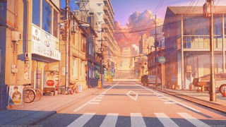
Among the two, I tried thinking if I wanted to go in a more obvious direction or a less direct one. I decided I wanted a less 'direct' version, allowing for viewers to look and observe, but sometimes see either one or two figures, depending on where their focus is. Firstly, I tried to think of subjects I could use. After thinking for a bit, Red Riding Hood galloped her way into my head. It was probably because of the fact I had played The Wolf Among Us a few months ago.

Figure 2.3 The Wolf Among Us: A Telltale Games Series

Figure 2.4 Red Riding Hood, 2011 film

Figure 2.5 Disney's Red Riding Hood, 1934
With that, I began sketching an idea. I decided to let Red Riding Hood's hood be the object which frames the figure of the wolf which chases after her.

Figure 2.6 Sketch of Gestalt Theory idea
To make my life easier, I decided to look for side profiles to make drawing easier. I scrolled through Pinterest & Google and found these two side profiles I really liked.

Figure 2.7 Gracie Abram's side profile

Figure 2.8 Hwang Yeji's side profile

Figure 2.9 Outline
Next, I input flat colours to tell which colour should go where. This allowed me to pre-plan my work early on.

Figure 2.10 Flat colours
After getting a clearer idea of the colour palette, I got working on the shading to make the work more dynamic.

Figure 2.11 Shading
Finally, I did the background, making sure people cold still identify the figure of the wolf. I wanted the background to resemble being in a dark forest. Surrounded by trees, but still had light coming through.

Figure 2.12 Added background
To allow me to get a peace of mind that I had accomplished what was needed, I messaged a few of my friends and asked them for their thoughts.
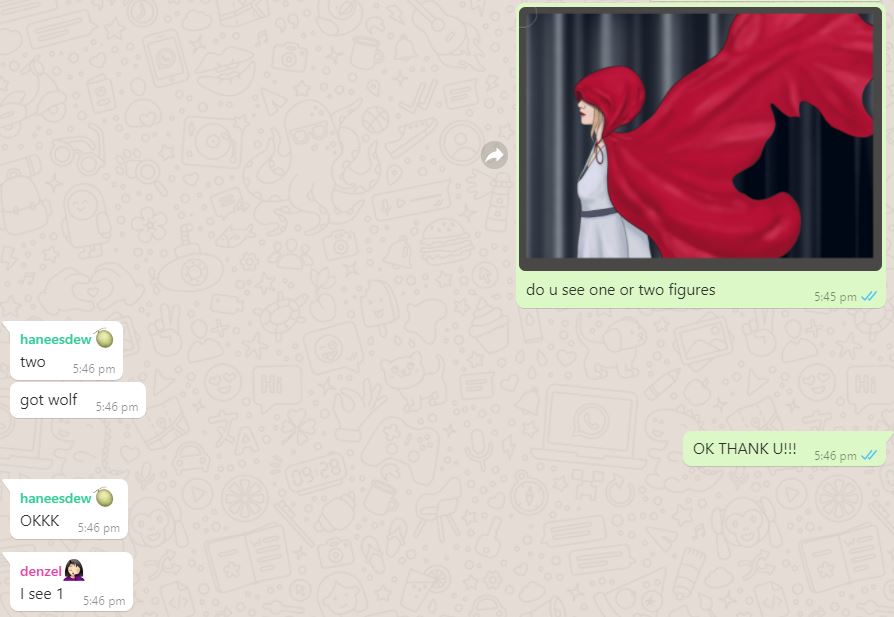
Figure 2.13 Whatsapp chat with my friends
Asking them allowed me to learn how different people might see it. As for my friend, Denzel, it took circling the outline of the wolf for him to finally see it whereas my friend, Nelsa, saw it the moment she saw it. This told me I had achieved my goal of making it less 'direct', but also allowed for viewers to identify it.
Final Outcome:
Red Riding Who?
Red Riding Hood is walking through the woods. She thinks she's alone. However, as she travels through the woods, she feels a shadow behind her. Who could it be? What could it be? Maybe something is hiding behind her. She's unsure, but this dark forest doesn't seem to have an end. Will she make it out alive?
Contrast
In my notes, it was highlighted that a visual experience would be monotonous without contrast. I knew I wanted to play with that idea. A monotonous experience, but have something exciting to contrast it and make it bright! With that, I got to sketching ideas.

Figure 2.14 Contrast sketches
After slowly analyzing three of them, I decided that my bear idea was my favourite. To me, it showed a good amount of contrast. Not only that, it also allowed for my favourite styles to shine through; false borders and cuteness.
At first, I decided to paint it. Below is the base colour I started with.

Figure 2.15 First layer of paint
Then, I used black to colour in the mouth and eyes. Then, I used some white to colour in the teeth as well as the light in the bear's eyes.

Figure 2.16 Adding black paint

Figure 2.17 Adding bright red
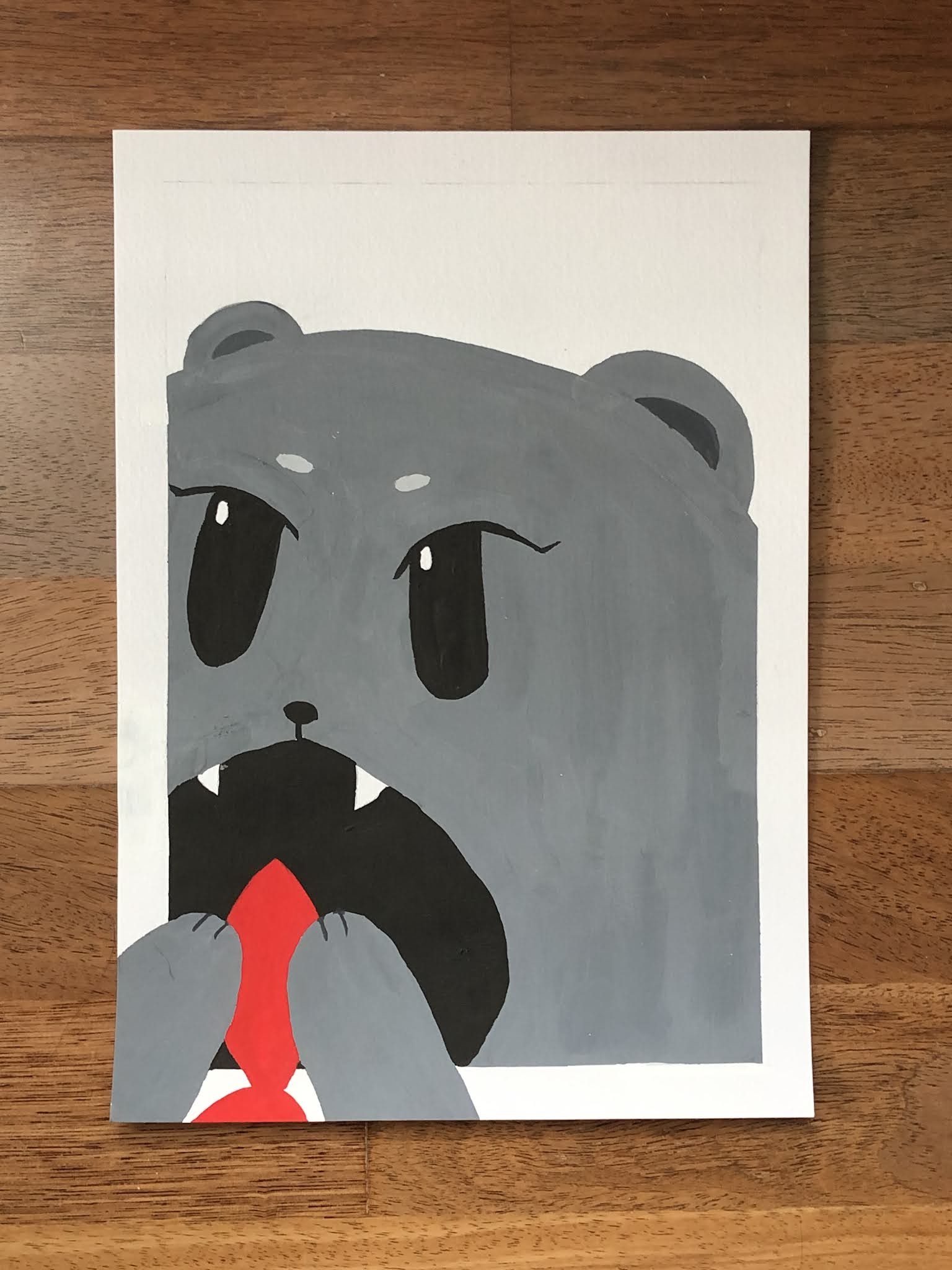
Figure 2.18 Final physical copy
After looking at it, I kept realizing some issues. The paint didn't paint as flatly as I wanted to which was quite distracting so, I decided to digitize it. First, I tried recreating the entire work. I also added some shadows before the ears.

Figure 2.19 Recreation of bear
Then, I redid the paws holding the fish. I also added some shadows on the fish. I also added a background to further intensify the false border idea.

Figure 2.20 Adding paws & fish

Figure 2.21 Adding a lighter shade of grey to surround mouth.
After receiving feedback from Dr Charles, I decided to redraw the fish to include more of the fish tail.

Figure 2.22 Changed fish
The Bear & The Fish
Ponder, ponder. The grey bear slowly is whisked away into an existential crisis. She's questioning life's greatest mystery. "Why do bears exist? To eat and hibernate?" Her questions are indeed important. However, as the monotonous bear holds a bright red fish in her paws, a light bulb sparks in her head. "Indeed!" she thinks. "My purpose is to eat this bright red fishy!" She happily chows down on her meal, content that she has now found the meaning of a bear's life, to eat bright red fishes.
Feedback
07/09/2021
Gestalt: Dr Charles reassured me of Gestalt allowing to imply meaning.
Contrast: Dr Charles asked us the difference between achieving contrast & contrasting something. It allows us to create more authentic pieces. He also mentioned how contrast allows a shape to be identified.
Gestalt: It was mentioned that my references were good.
Contrast: Dr Charles mentioned how he liked that Contrast had illusory lines as it brought depth to the work. He also mentioned how the tail of the fish could be complete as it would complete the whole viewing journey.
Reflection
I am tremendously grateful for this exercise. It has allowed me to learn more about Gestalt Theory & Contrast very intimately. Before this exercise, I do not think I have ever purposefully made a design based on these, but with Dr Charles' feedback on how to make things more authentic has helped me. It paints a clearer picture for me. I really enjoyed this exercise as the processes really allowed me to indulge and practice drawing things I enjoy (cute bears & cloth). Overall, I am very pleased with this exercise.
Picture Credits
Figure 1.1 - Dr Jinchi's lecture slides
Figure 1.2 - 1.3 - Personal recreation of images in Dr Jinchi's slides
Figure 1.4 - https://www.pinterest.com/pin/766667536571592037/
Figure 1.5 - Personal documentation
Figure 1.6 - https://www.pinterest.com/pin/766667536571592110/
Figure 1.7 - https://www.pinterest.com/pin/766667536571592123/
Figure 1.8 - https://www.pinterest.com/pin/766667536571592210/
Figure 1.9 - https://www.pinterest.com/pin/766667536571592240/
Figure 1.10 - https://www.pinterest.com/pin/766667536571592339/
Figure 1.11 - https://www.pinterest.com/pin/766667536571592628/
Figure 1.12 - https://www.pinterest.com/pin/766667536571592593/
Figure 1.13 - https://www.pinterest.com/pin/766667536571592560/
Figure 1.14 - Dr Jinchi's lecture slides
Figure 1.15 - https://www.pinterest.com/pin/766667536571592468/
Figure 1.16 - https://www.pinterest.com/pin/766667536571592682/
Figure 2.1 - Brave. Retrieved from https://www.pinterest.com/pin/17240411058812679/
Figure 2.2 - Peter & The Wolf. Retrieved from https://www.pinterest.com/pin/3307399709710307/
Figure 2.3 - The Wolf Among Us. Retrieved from https://en.wikipedia.org/wiki/The_Wolf_Among_Us
Figure 2.4 - Amanda Seyfried as Red Riding Hood. Retrieved from https://www.empireonline.com/movies/reviews/red-riding-hood-review/
Figure 2.5 - Animated Red Riding Hood. Retrieved from https://disney.fandom.com/wiki/Little_Red_Riding_Hood
Figure 2.6 - Personal Documentation
Figure 2.7 - Gracie Abrams. Retrieved from https://www.pinterest.com/pin/766667536571808453/
Figure 2.8 - Hwang Yeji. Retrived from https://www.google.com/search?q=side+profile&sxsrf=AOaemvIp3E47641zocIZKesyOt6fP_iBcg:1631884234964&source=lnms&tbm=isch&sa=X&sqi=2&ved=2ahUKEwjRoY7BiobzAhXuqJUCHc1qBVUQ_AUoAXoECAEQAw&biw=2844&bih=1476&dpr=0.9#imgrc=0MisV7ffybQD9M
Figure 2.9 - 2.22 - Personal Documentation


