Illustration and Visual Narrative: Task 01

26/08/2021 - 24/09/2021 (Week 01 - Week 05)
Adena Tan Sue Lynn / 0345769 / Bachelor of Design (Honours) in Creative Media
Illustration and Visual Narrative
Exercises
Lectures
Week 01 (26/08/2021)
- Our first exercise: The Vormator Challenge
- The theme of our Web toon: Horror
- Programs we will be using for class: Adobe Illustrator, Adobe Animate & Adobe Photoshop
Week 02 (02/09/2021)
Today, Ms Noranis introduced us to character design and shared a few insightful information on creating outstanding characters.
Firstly, we were asked what are our favourite characters and to identify the characteristics that make them so appealing. Quickly, I thought about it and thought of Denimalz! To me, they are very cute despite their simple design.

Stylized Designs make a character stand out!
- Iconic characters
- Easily created
- Profitable


Principles of Character Design
- Define a silhouette which can create an iconic look
- Exploration of interesting shapes can bring intriguing designs

- Determines hero & protagonist
- Has qualities that can cause certain emotions in people


- Picking a visual element in a character and exaggerating it makes a character outstanding & memorable
- Occasionally, using cultural elements and adding it to a design makes it uniquely authentic

- Elements must be put together in a tasteful manner
- Visual Hierarchy with balancing visual elements

- Behaviour/expression/personality visually shown allows for audiences to fall in love with characters

Week 03 (09/09/2021)
On this fine day, we were bestowed upon the knowledge of Composition. It allows for us to analyse visual hierarchy.
To understand good composition, it is important for us to identify types of shots/compositions. With this, I tried to try and match the types with scenes in media I have watched before.
Establishing = Wide

Bird's Eyeview = Looking down

"Framing" = Framed specifically

Medium Shot = Middle

Close Up

Worm's Eyeview = From ground, more personal

Positive vs Negative
Balanced distribution is important. Positive (+) is focus, Negative (-) is non-focus
Week 04 (17/09/2021)
Compostion
Perspective
- Allows for art to have form & volume
- Has buildings receding into the distance
- Light & shadows play an important role
- lowkey dorky
- uneven

- Creates depth
- An Illusion
- A representation of objects (Creates 3D optical illusions from a 2D surface)
- 1 Point
- 2 Point
- 3 Point
- 4-5 Points (Fisheye)
Chiaroscuro

Definition: The usage of light & dark to create the illusion of 3D volume on a flat surface.
Used to:
- Increase dramatic tension
- Create sensational effects
- Pull attention to subject intensely
- Create tasteful compositions of negative vs positive spaces
- Studies form and value practice
Instructions
Exercise 01: Vormator Challenge
To start, I decided to sketch some ideas. As I couldn't think on making a character just by looking at the shapes, I started sketching characters that came to mind. My main ideas were animal hybrids, and weird names. Crocospy-der was based on a crocodile & spider, but my brain couldn't help but input a pun in there, making him a spy. Next, BCCat, who was meant to just be a cat with wings, got her name as I was stressed with e-mails, and I wanted someone so badly to help sort out my cluttered mind. Next, was Ham(bur)ger, who is a mix between a tiger and a hamster. They're a hamburger patty because my brain couldn't think of how to combine the two animals. Next, was not the most creative, but it was a noodle bunny! I was very hungry when I was sketching and it may have transferred onto my imagery. Finally, the character in the middle was based of a flower when turned upside down.

After getting Ms Anis & Ms Jennifer's feedback on the sketches, I knew I wanted to choose the BCCat as my character. To me, she was so cute to look at, and the sketch of her replying to emails on the bottom right made me giggle. She is my chosen one.
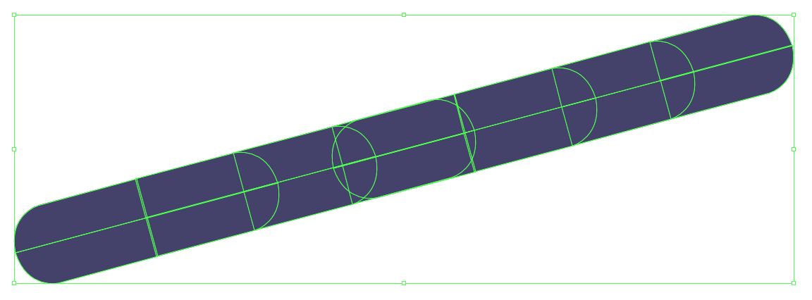
First, I decided to make the Vormator shapes in Illustrator. Before starting, I made sure I obtained the correct file of the shapes. Below is what was provided through TIMeS.

Next, I traced over the shapes using the pen tool. I followed Ms Jennifer's method which she showed in class, which was to draw half of shapes like the Zerk & the Drop and combine them later.

To get used to making images with the shapes, I decided to start with making BCCat's eyes. Firstly, I started with the 'sparkle' in her eyes. I mainly used 'the Drop' as I thought it made a nice sharp edge.


After that, I continued making the eye. I included shapes like the Wurst, the Zerk, the Tentacle & the Bar. Doing this also taught me how I could 'erase' certain parts of the shapes by placing other objects over them to create a smoother line.


Below was the result of BCCat's eye which I was satisfied with.

Next, I proceeded to do BCCat's head. For this, I mainly used the Bar, the Badge, the Zerk and the Wurst.


For her whiskers, I combined multiple Zerks. I used the reflect option for the ends to ensure it was rounded.
After doing the head, I decided to do the body. As I wasn't sure of the proportions, I closely followed my sketch, to ensure I didn't mess her body up.


Next, I did her legs. I reused her whiskers for her legs, and added the Wurst & the Zerk together to create her feet.


Finally, I added some details, like a small patch in the middle of her body as well as some "waves" on her wings.


Below was my first tryout of BCCat.

However, even though I had such a soft heart for this version, it wasn't my favourite. This was because of the messy layout of the shapes which made some parts look jagged. I also wasn't the biggest fan of the wing details, and I knew I had to attempt making another version of her.
To start off, I started with the head, and I was already somewhat satisfied with the shape, I just needed to clean up some parts. Besides adjusting the curve on her face, I also made it wider, to make her chubbier. I also adjusted the size of her eyes, to have somewhat of a perspective that the right side of her (her left) is facing the viewer.


Not only that, I also added some blush and her ears. It gave a cuter look, which I liked. For the blush, I used the Wurst & replicated it to extend to make it a bit longer without disrupting the original Vormator shapes.


Next, I redid her body. As I wanted to make it more simplified, I tried focusing on her wings, which allowed me to focus more on making her overall shape smoother.

Then, I duplicated it on the left side. Then, I made the body & reused some of Version 1's features, such as her feet & her belly detail.


However, I remembered Ms Anis & Ms Jennifer's suggestion to make her more 'lively' and decided it would be best to change her colour palette. I opted for a more pink look, to make her look even sweeter.

Then, I started adding her 'wing' details. I used the Drop and then added another Drop on top, to make it more of a curved line.

After that, I started playing with the Gradients. Something really important I used was the Pathfinder tool which allowed me to properly place gradients how I wanted to without them looking weird. I think the Gradient tool is my favourite thing in Adobe Illustrator.

Exercise 02: Game Card
Before starting, I decided to look at some Game Cards to gain some inspiration. Below were some of my favourites.


Next, I decided to sketch the back of the card. Since BCCat's special trait is that she's great at emails, I thought of incorporating laptops, wifi & computer mouses.

Satisfied with my sketch, I decided to go into Adobe Illustrator to start on the card. Below was the screenshot of my flat layout during Class tutorial.

After tutorial, I decided to once again play with the gradient of the background as well as the laptop. I also ended up giving my wifi symbol a 'shadow'. Also, I edited the copy text of BCCat's stats to make it sound and look nicer.

Continuing to look at the card, I decided to get rid of the Computer Mouse corners as they looked really messy and out of place. Not only that, I edited the text's typeface into Omnes. I think it gave a more playful look to the card & allowed it to be easy readable. I also decided to fully embrace the 'false' border which is shown in the previous screenshot by making the front card have a 'false' border too.

Finally, I added the name of the Game Card. At first, I wasn't sure of what to name it, but I quickly realized it was good to call it "Office Buddies". Office Buddies related to the e-mail concept BCCat has, and would make sense with the 'Boss HP'.

With that, I was finished with my card.


Exercise 02: Game Card


Feedback
Reflection
I'm grateful to have been given this exercise. The Vormator challenge has taught me so much about Adobe and how to create a character I'm really happy with. I also never knew half of the features before I started this exercise. Not only that, the Game Card exercise allowed me to learn more about composition and layout which I'm sure will be tremendously helpful in the future. Overall, I'm incredibly pleased with this task, and am looking forward to learning even more.
References


