Digital Photography & Imaging: Week 05
WEEK 05 (20/09/2021)
Adena Tan Sue Lynn (0345769)
Bachelor of Design (Honours) in Creative Media
Digital Photography & Imaging
Conceptual Poster Design
Poster
- A conventional medium to convey information to a target audience.
- Can be cluttered or straightforward.
- To avoid confusing viewers, refrain from using too many colours, fonts, images & animated figures.
- Can generate awareness on an issue.
- Is it a poster for brand awareness?
- Is it an advertising poster?
- Is it a Public Service Announcement Poster?
Creative Posters is made up of four key structures:
- Title
- Graphics
- Text
- White Space
However, layout, flow & colours affect the overall order & style of the above mentioned key features.
Title: Descriptive indicator of the contents of the poster.
Graphic (photo): Must appear in context with the main text. Higher resolution pictures (300dpi+) should be used.
White Space: Breathing room. Helps viewers to avoid feeling overwhelmed by the information presented.
Layout: There are many design layouts. For this project, a graphics-centred layout is suggested.
Flow: Coordinates with how the audience's eyes move around the different parts of the poster. It is important to maintain hierarchy when displaying your image.
Colour: Draws the viewer's gaze and defines different sections of the poster.
Practical
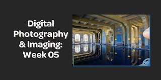
Hearst Mansion (Shazam)
First, I watched the video provided to learn how to edit the photo. Keeping the notes in mind, I started editing the Shazam version.
I started by cropping Shazam.
After that, I pasted Shazam into the Hearst Mansion photo. I made sure to use the Shift button while transforming so that Shazam wouldn't look weird.
Then, I used the 'Match Colour' option which allowed for Shazam to blend in better.

After that, I added a shadow behind Shazam, to make him more believable.
After that, I duplicated the Shazam layer and reflected it so that it would be upside down.
Finally, I added a blur and colour corrected the photo.
Final Result:
Hearst Mansion (My reflection)
Then, I started getting ready for my version. Firstly, I took some photos of myself. Below was my chosen one.
Then, I started cropping it in Photoshop.
Next, I transformed myself into the Hearst Mansion picture. I had flipped myself as I thought it would look more suitable.
After that, I added a shadow & matched the colour to the photo. Then, I reflected myself & edited it according to how I did the Shazam version. I also remembered to blur my reflection.
Final Result:


