Brand Corporate Identity: Task 02

WEEK 01 - WEEK 07 (30/08/2022 - 11/10/2022)
Adena Tan Sue Lynn (0345769) / Bachelor of Design (Honours) in Creative Media
Brand Corporate Identity
Task 02
DIRECTORY
- Lectures
- Instructions
- Final Submission
- Feedback
- Reflection
- Further Reading
- References & Picture Credits
LECTURES
Lectures 01 - 03 can be found here.
Lecture 04: Brand Ideals
A brand ideal is a higher purpose of a brand or organisation which goes beyond the products and services they market. The brand's ideal is the inspirational reason for being and existing. It is a larger goal.
The best leadership team would be having a shared intention. Without this, it would be hard to connect with the target market. An ideal is a process.
Brand values are able to deliver real engagement and directs a brand towards a better status with their consumers. They act as a "true north" of a compass towards market success. Hence, they should be kept and followed consistently. Good brand values work because they reflect consumer's ideology, but have the brand's passions in mind.
"A brand ideal is a higher purpose of a brand or organisation that goes beyond the products or services they sell."
Every brand ideal is predicated on its values. Values are considered the foundation of a brand. It allows for the brand to achieve its brand ideals.
Examples of ideals are:

Vision: It requires courage. An ability to have unique ideas through a visionary mindset. However, it is not enough to imagine, but there must be action taken. Having a vision is critical to the brand's identity.
Meaning: Rarely immediate and revolves over time. As designers, we must translate this meaning visually to be explained well to be understood & communicated.
Authenticity: A self-knowledge practice that helps a brand identify its identity, strengths, expression and more. Customers identify with authentic brands as they feel like the brands are to be trusted.
Differentiation: All brands are constantly competing with one another to get the consumers' attention, focus and loyalty. It is not enough to be different. A really good brand leaves a big gap.
Sustainability: The ability to have longevity in an environment in constant flux & characterised by future permutations which cannot be predicted
Coherence: The brand should feel familiar towards a consumer. It is a baseline which builds trust, loyalty and satisfaction.
Flexibility: An effective brand identity positions a company for change and growth as it is inevitable.
Commitment: It has to ensure everyone who interacts with the brand would have complete motivation and dedication for the brand to succeed.
Value: The results of the brand need to sustain the brand. A brand is an intangible asset.
During the lecture, Mr Vinod shared some insights into Google, Nike & Apple's branding which gave a lot of knowledge on how brand's carry out their brand ideals.
Lecture 05: Positioning
Brand positioning is the process of positioning the brand in the mind of the consumers. Other terms are positioning strategy, brand strategy or brand positioning statement. However, some state that strategy is a long term plan and influences the brand's positioning. "Creating your brand strategy is like drawing out a map, and positioning is determining your location & destination," - Willis, 2017.
Once a brand is successfully position, it is difficult to reposition. An example is Volvo's unappealing perception to men due to it's focus on safety which reduced its sex-appeal.

Currently, there are too many companies which feel the same, failing to stand out from the rest. To stand out, uncovering your competition's lack in areas is crucial. Find a whitespace in the market where other's are ignoring its' opportunities.
1. Try to take on the market leader & beat them at their own game. It is possible in markets with no clear leader, but it does require money and time. An example of this is Pepsi & Coke.
2. Focus on a niche market within a larger market that is being underserved where other companies aren't meeting their needs.
3. Reframing the market with new terms. Make the benefits highlighted by others irrelevant or boring. However, this works if the product/services have innovative elements.
4. Change the game. Be the first in the market, being able to invent a new market. Market disrupters are Uber or Xerox. The downside is that people can copy you before there's a chance to establish the brand. (Grab)
In order to create position strategy, a brand's uniqueness must be determined. Questions to determine if the brand is good are:
- Who are you?
- What do you do?
- Why does it matter?
- Determine how the brand is currently positioning itself
- Identify the direct competitors
- Understand how each competitor is positioning their brand
- Compare the brand's positioning to the competitor's to find a uniqueness
- Develop a distinct and value-based positioning idea
- Craft a brand positioning statement
- Test the efficacy of the brand positioning statement
To build a positioning statement, these are the four essential elements.
- Target Consumer: What is the concise summary of the attitudinal & demographic description of the target market that the brand is trying to appeal to?
- Market Definition: What category is your brand competing in and what relevance does it have to consumers?
- Brand Promise: What is the most compelling benefit to the target market that the brand can own relative to competition?
- Reason to Believe: What is the most compelling evidence that your brand delivers on its brand promise?
After answering all four questions, craft the positioning statement:
"For [target market], [company] is the [market definition] that delivers [brand promise] because [company] is [reason to believe]."
INSTRUCTIONS
Task 02(A): Logo Research & Analysis
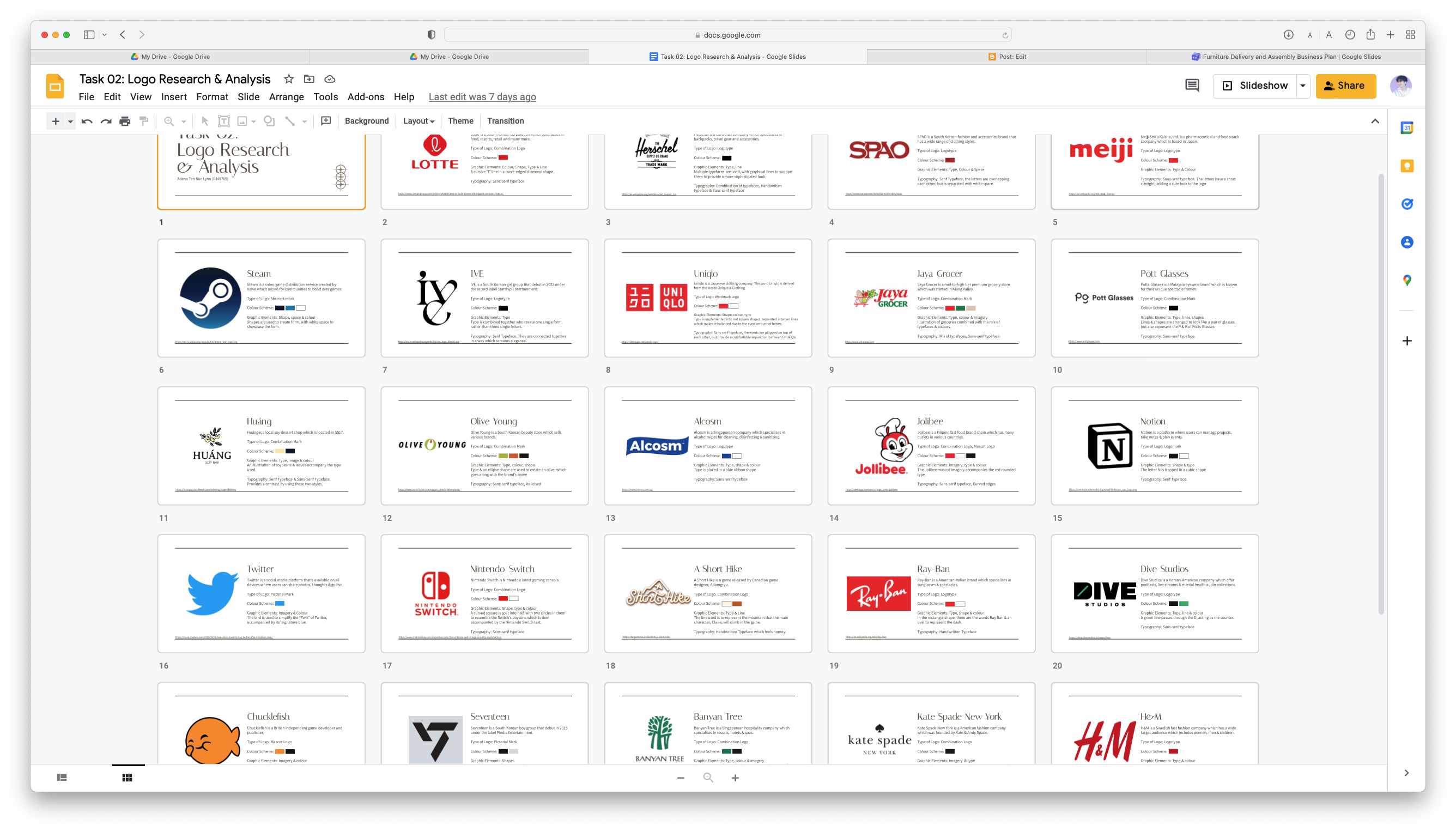
For my logo research & analysis, I opted to look into some brands' logos which I have been surrounded by in the past few months. Below are the brands I chose for this task and how I've seen them!
- Lotte: When I was clearing out my stuff, I found a ticket from Lotte World from my trip in August.
- Herschel: It's the brand of my bag pack! I highly recommend this brand if you are looking for one.
- SPAO: I saw my jacket from this shop in my closet.
- Meiji: I was craving Hello Panda biscuits and bought them.
- Steam: I see this everyday on my computer.
- Ive: I was listening to one of their songs when I noticed their really cool logo design.
- Uniqlo: One of my favourite clothing brands! I'm almost always wearing something from there.
- Jaya Grocer: I do my weekly groceries here.
- Pott Glasses: I recently got a new pair of glasses from this shop!
- Huáng: One of my favourite soy dessert cafés.
- Olive Young: I found a receipt from here in my wallet!
- Alcosm: My mother bought a lot of these recently as you can never buy too many.
- Jolibee: I've never eaten Jolibee before, but I have seen multiple ads for it.
- Notion: This is the application I use to keep track of my assignments.
- Twitter: One of the social medias I frequent a lot as I get a lot of my updates on my favourite artists here!
- Nintendo Switch: Just laying on my desk.
- A Short Hike: A game I really grew found of during the semester break! Really calming and so fun!
- Ray-Ban: I accidentally brought my sunglasses to uni instead of my glasses.
- Dive Studios: It is the home of my favourite podcast, Get Real!
- Chucklefish: Whilst I was looking on Steam, I was reminded of this game developer through a game I had installed.
- Seventeen: My ultimate favourite K-Pop group!
- Banyan Tree: I found a sewing kit in my drawers from this hotel.
- Kate Spade New York: My wallet is this brand! It was gifted from my uncle.
- H&M: One of the days, I decided to take a break by going to Sunway Pyramid and walked into H&M to see some clothes.
- Josshere: One of my favourite digital artists! I was planning to commission her for my first tattoo, so I thought it would be fitting to place her logo here.
- The Ordinary: I use their glycolic toner on my arms.
- Häagen-Dazs: One of my mum & I's favourite ice-cream brand.
- Osulloc: My aunt recently gave me a pack of teabags from this brand.
For my slides, I got the below slides from SlidesGo.

For my slides, I changed the background colour to white in order to make the logo designs stand out more. Then, for each logo, I prepared a small description of the company, the type of logo, the colour scheme, the graphic elements found and the typography (or lack of) used.
The final slides outcome is listed in Final Submission.
Task 02(B): Logo Design
First, we were instructed to think and list down three ideas for our brand. Below are the prompts we were required to use for this mini exercise.
- Your career / business
- What service(s) / product(s) are you providing?
- How do you differentiate yourself from others? (uniqueness of career)
- Who will be interested with your product(s) or service(s)?
- Name & Rationale
Thus, I went about my days, trying to figure out things I was interested in and wrote down some ideas for the brands I would be passionate about.
1. Handmade Soaps
- Selling handmade soaps which are free from harmful chemicals (SLS, etc).
- Soaps are skin-friendly, especially for those with skin conditions such as eczema. Himalaya salts in soap will provide many health benefits, such as an improve in serotonin, energy, breathing, sleep..
- General public (?) or those who have sensitive skin
- Salty Soap Company (Playing to the fact that the soaps indeed have soap in them!)\
- Selling soy milk and taufoofa with hidden twists aka fusions.
- Since there are many shops selling soy products, a twist or elevation could be made. Using a fusion of flavours to elevate the soy flavours. (I think Korean flavours for my alias name is Korean)
- Foodies or genpub
- Sobuya (My alias online is Dubu (Tofu) or Soya. Very soy based but I love soy products, so why not bring them to life?)
- Restaurant where customers have to literally wait for produce to be harvested.
- Fresh concept? You can visit the farm :D
- Education wise would be interesting for families
- Sprout (Since we are farming+cooking, why not be inspired by the plants themselves. Sprouts signify growth and that would mean growing my business!)
After Ms Lilian's consultation, she told me to go for the one I was most passionate about, which is Idea #2! Thus, I did the Mind Map as advised to have a better idea how to structure my logo and what my brand would be like.


After doing my mindmaps, I looked to Pinterest to get some inspiration from existing designs. Below is my board for my logo.

I also drew some sketches after as I had some creative juices flowing.

After I received my feedback from Ms Lilian regarding my progress, I redid my Brand Idea Mindmap as I needed to explore more. Thus, I came up with the below.

I also sketched a bit more. I had less motivation this week, which reflected my sketches during this week.

After getting some more feedback from Ms Lilian, I proceeded to do more sketches to branch out my ideas even further. For this, I looked at even more references before I started, as I did not want a repeat of the previous week.

I also proceeded to do a bit of my digitisation to not waste any time. I started with doing three of my ideas which I liked.

Next, after I received more feedback from Ms Lilian, I worked on my work even more. I wanted to focus on two which I thought would be the most interesting to work on as I wanted to put most of my efforts into the two. With that, I chose the first and third one to further work on.
Below is the progression for my first one:

- First logo with basic lines. The typeface used for this was Trajan Pro 3.
- Second logo with play of making lines thicker and have curved edges.
- I removed some of the curved edges as I thought it made it look better. I changed the typeface to Clash Display.
- Then, I separated the outer lines into two again, but I made the outer one thicker than the inner line.
- I created a grid and aligned it better towards the grid.
- Final Adjustment of Edged Curves and lines.


- First logo with basic lines.
- Added some curves. Not very noticeable as they're really small.
- I made the lines thicker and curve edges bigger to make it more noticeable. Added a wordmark using the typeface, Clash Display
- Added an outline outside to tie in everything together.
- Added circles to the outer outline to add some pizzaz to the overall look.
- Looking @ my logo through the grids, I added an ellipse's outline to the part where the 야 connects to the 'flower'-like pattern to make it more of a clean curve.
After that, I looked at some colour palettes I thought would be suitable with the brand and the logo.


I really focused on the cream and green colour. As I was looking through colour combination possibilities, I realised how nice pink goes with green. Perhaps this is due to how red is the complimentary colour of green. Pink compliments green, but in a subtle way. Thus, I decided to make it my secondary colours.

Once I determined my colours, I got my two ultimates logos from each design. Then, I made them in the third green of my primary colours (#3C5148)

Moving on, I looked at possible choices for my brand typefaces. For this, I typed Sobuya and tried it out in multiple typefaces.

After I had gotten some feedback from Ms Lilian, she had advised me to try them out to have a better idea of how the typefaces would work with one another. I did as she suggested, even trying out other typefaces to see some sort of variation. In the below, I think it is pretty obvious my heart was fully set on Satoshi being the body text due to it's short x-height, making it look quite unique.

I settled on the bottom left option as I liked the contrast between the serif heading and the sans serif body text. Coincidentally, the Latin typefaces both started with S! The heading is Sentient whereas the body text is Satoshi. For my Korean letters, I used Nanum, which is available in both a serif and sans-serif style.

Next, I did a majority of work in another file as I felt my original file got a bit too messy. For this, I focused on laying down what was required as listed in the MIB.

After I considered myself done, I exported everything and combined all the files into a PDF.
For my logo GIF, I decided I wanted to make it one where the Korean characters grow within the traditional flowery shape. Thus, I proceeded to do it frame by frame as I found this the best way for myself. I did it from end to start as I found this to be the most natural in terms of movement.

Next, I compiled all the frames in Photoshop.

Finally, I'm done.
FINAL SUBMISSION
FEEDBACK
It sounds as if I was more excited about the Sobuya idea. Ms Lilian said all my ideas for the brands were good as they would be easy to build. I was allowed to choose any of my ideas that I was interested in.
Week 03 [13/09/2022]
For the mindmaps, I can extend the brand by thinking of space concepts, thinking about the name more, etc. It can be farfetched as much as I'd like. I can think about the overall concept. Ms Lilian suggested I try and explore more with the different type of logos.
Week 04 [20/09/2022]
My second set of sketches look less semangat than the previous week's. I was advised by Ms Lilian to explore the forms more of the minimalism route. She also encouraged me to explore more of the single line logo sketch as the 야 is more curved than the other letterforms. I would require to explore it in more depth.
Week 05 [27/09/2022]
I am on the right direction according to Ms Lilian. For my progress, I would need to continue to explore the form and consider the thickness of strokes and the curved points I have in my octagon logo. This is due to the consideration of the logo in minimum size.
Week 06 [04/10/2022]
My forms look better this week, as there were more consideration towards the forms. We agreed on my final logo as it looked the best to the both of us. Ms Lilian said that the form with colours felt complete. For my brand typefaces, she suggested for me to try out and play around with using typefaces as body text & heading. She liked Satoshi Medium for my brand due to the short x-height. For my submission, I was told to have separate versions of my logo (one with just the pictorial and another with the wordmark as well) but in the same file.
REFLECTION
Experience
This task has definitely been really eye opening for me. To be honest, I never thought I could make something like Sobuya's logo as I was quite unsure of myself sometimes during these weeks. However, I'm really happy with how I came to create my logo.
Observations
With the different logos I've witnessed through my time during this task, I realised how amazing it is to witness and try to figure out what makes the logo so unique and so interesting. For example, Mascot logos overall feel more welcoming and friendly compared to logos with just a wordmark. It is very interesting how certain elements can also affect the whole look.
Findings
I found out a lot about logos during my time learning about creating a good one. For one, I am usually quite stubborn with my ideas, but I found that doing the necessary requirements like the mind maps and the 60 sketches allowed me to learn more about my brand and made me open my mind up more to how it could look like.
FURTHER READING

A logo grid is a grid system to create certain shapes and designs for a logo. Usually, a square grid system is used, with older works being done on square grid papers. Using a logo grid is not mandatory, but it is recommended due to the many advantages.
It allows for organisation, visual consistency, cleanliness, scalable and polished designs.
To effectively use a grid in logo design, a relevant logo grid has to be chosen from the start. The structure of the grid can be modified to suit the logo's needs. Below are some examples of grids:
While the grid is mathematically pleasing, it is important to have a balance when using these grids as it is not always the way to add charisma to a logo. Logos are like humans too! They need to break free from society (grids) too!
REFERENCES & PICTURE CREDITS


