Information Design: Project 01 & 02
Directory
Instructions
Project 01
To obtain a recipe for the project, I had to find one from the Pasta Grannies' YouTube channel. I watched a few and shortlisted the ones I thought were really interesting.
Overall, I was very impressed how each recipe was done, and how much detail went into it! However, I decided to choose Bruna's spinach & ricotta strucolo. I had never heard or even seen this dish before, so I was really intrigued by the steps and how it looked in the end.
Firstly, I studied the video and took some notes down. Below is a photo of those notes.
Firstly, I watched the video while writing down notes without a filter. At first, I separated the ingredients & the steps to make it easy for me later on. In total, I wrote a total of 18 steps.
Then, at the bottom, I simplified the instructions into 10 steps. I also wrote Bruna facts just in case I could implement it into my final poster.
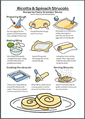
After this, I started sketching the poster on Medibang Paint. I knew I wanted to showcase the steps in words as well as visually. Usually, while I'm cooking, I can get quite confused on how it's meant to be done, so when the recipe author supplies visuals, I am really grateful for their efforts. Thus, I decided to implement visuals for each step. Whilst doing this, I decreased one more step to fit nine.
Then, I proceeded to Adobe Illustrator. Firstly, I retyped the steps, re-wording some and changing their placement. I also added the link to the video as instructed by Ms Anis.
After this, I did the line art for the steps as well as the final.
Following this, I continued with the flat colours. For this, I used mainly yellows with some blue accents.
Next, I added details to each of the visuals.
Next, I added the background.
I took inspiration from Bruna's restaurant sign as I thought it would add a touch of Bruna into the overall design.
Final Submission:
Project 02
For the instruction video, I decided to utilise what I had learnt in a previous module, Illustration & Visual Narrative.Firstly, I converted the poster into a video format in Adobe Illustrator.
I decided it would be efficient and useful if I were to label the items by the frame, which can be seen in the layers tab.
Next, I transferred the file into Adobe After Effects. For this, I found the best to take advantage of for this video was the Opacity & Position as well as masks.
For details, I put five frames in between each of the shots, to ensure that they were well paced and didn't jump in too fast. As for the opacity, I put seven frames in between so that the opacity flowed in nicely, rather than rushed. Luckily, even with this tactic, my video didn't exceed over 60 seconds.
Below is an example of what the timeline looks like. Looking at it, it looks somewhat like a platform game!
After I was satisfied with the graphics, I wanted to add some music to accompany the visuals. For this, I wanted to stick to Bruna's upbringing in Italy. Thus, I decided to look for some Italian music.
Looking on YouTube for non-copyright Italian songs, I found that some weren't the mood I was hoping for. Then, I stumbled across the video below, which I thought was absolutely perfect for the overall video.
I took the first 60 seconds of the video as when I first heard it, I immediately knew it was the one.
To input the music, I used Adobe Premier Pro. I added a slight fade to the end of the video's audio. Then, I uploaded it onto YouTube.
Final Submission:
Exercise 03
For the Typography video, first, as a group we separated our parts as below.
After that, we set off to do our own parts.
Firstly, I showed Mr Martin my part of the video's progress on 20th January. Below was the video he saw.
Below is my final part which was done on 23rd January 2022 at around 1:30a.m.. For this, I followed Mr Martin's advice and applied Title Safe to prevent my typography from going to far off to the edges.
Below is the final compilation:
Exercise 04
Firstly, I followed Mr Martin's slides to create a practice run.
After this, I started making the official bar chart. Firstly, I laid down all the graphics I planned to use, such as the bars, the measurements, the causes and more.
Below is the final product
Feedback
20/01/2022: Mr Martin adviced me to turn on Title Safe for my Typography video. He also suggested to export using After Effects instead of Adobe Media Encoder so that my coloured background doesn't disappear.
08/02/2022: Ms Anis reminded me to include my source inside the poster. She also told me to decrease the length of some sentences as they were too wordy.
14/02/2022: After asking Ms Anis for feedback on my Project 01, she instructed me to proceed to the video.
Reflection
Overall, I really liked these two projects. They were insightful and fun which made me enjoy doing them a lot. I was able to experiment with a new format, which I am grateful for, as I think it will be fun to practice or even just do in the future!
It was a beautiful way to learn how to create interesting, yet informational piece of info. I will hold these learnings close to my heart (and brain).


